Designing Widgets
The Widget Designer lets you fine-tune a widget's appearance and behavior.
For a short video overview of this process, see below:
Opening the Widget Designer
To display the Widget Designer:
-
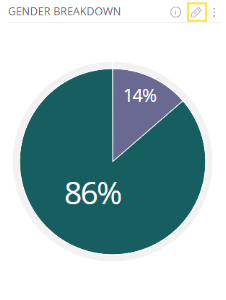
On the dashboard, click the Pencil (Edit)
 button that appears in the top-right corner of a Widget.

-
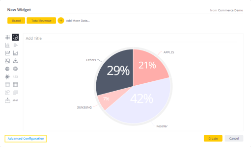
Alternatively, while creating a new widget, in the Widget Wizard, click the Advanced Configuration option that appears at the bottom-left of each window. The Widget Designer is then displayed showing the widget in the same state as in the Widget Wizard preview.

Navigating the Widget Designer
The Widget Designer enables you to select the data to be included in a widget in addition to providing a variety of options for customizing the visualization used to show the data.

-
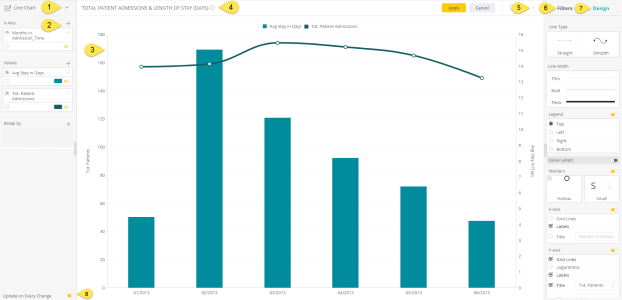
Selecting the Widget Visualization: Enables you to change the visualization of the widget.
-
Adding Data to the Widget (Data Panel): Used for selecting the values that you want to appear in the widget and those needed for grouping the data. The options differ depending on the visualization (chart type).
-
Previewing the Widget: The center of the window displays the current design and content of the widget, which automatically changes each time you select a different option in this window.
-
Adding a title to the dashboard: Click Set a Title and type in a new title for the widget. You can also add a widget title directly from the dashboard without entering the Widget Designer. See Customizing the Dashboard Layout to learn more.
-
Accessing More Options: Displays a menu of additional options for the widget.
-
Filtering the Widget (Filter Panel): Lets you manage the filters that affect this widget. Learn more in Filtering Dashboards and Widgets.
-
Designing the Widget (Design Panel): Provides a variety of options for fine-tuning the appearance of the widget, including labels, legends, line types and more. Some of these options need to be turned on for you to configure them. The options differ depending on the visualization (chart type).
- Setting the Widget Style(Widget Style): Provides a variety of options for customizing the appearance of the widget, including backgrounds, borders, corners, and more. See Setting Widget Style to learn more.
-
Update on every change: When selected, data changes are automatically and dynamically updated in the display. Not selected - you have to clickUPDATEto display your latest changes in the widget. Clearing this check box may be useful when you are working with very large datasets where query times might be slower.
For a short video overview of this setting, see below:
Fine-tuning a Widget
- To learn more about adding data and fine-tuning the design of a specific widget, click on a widget from the list below.
See also Selecting Colors in Widgets and Customizing Sisense with JavaScript.