Sunburst
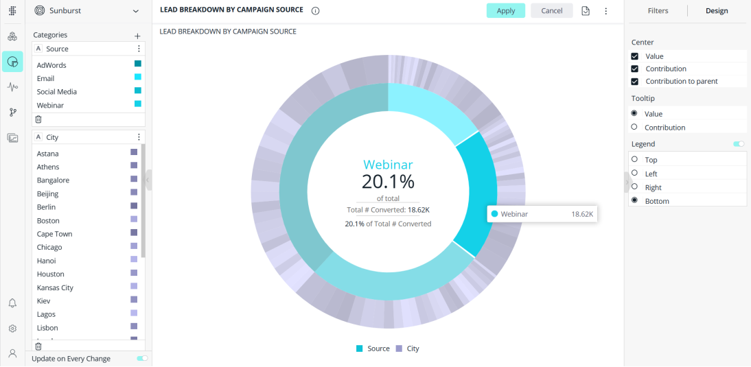
The Sunburst widget is similar to a pie chart but is multi-dimensional. Whereas a pie chart combines one field and one numeric value, the Sunburst widget can display multiple rings, one for each field. Each ring in the Sunburst shows a breakdown of its parent ring slice.
Note:
Sunburst charts have a limit of 1000 values.

For a short video overview of sunburst charts, see below:
Adding Data
-
In the Categories panel, select the fields whose values will be represented as slices of the ring.
Typically, the Categories of a Sunburst widget contain descriptive data. Multiple fields can be added, so that each field is represented as a ring whose values are broken up by its parent ring slice.
You can reorder the fields using drag and drop.
-
In the Values panel, click Add + to select the field whose values determine the size of the ring. Values are typically used to represent numeric data.
You can only add one field.
Designing the Sunburst Widget
Fine-tune the appearance of the Sunburst widget using the following tools.
-
Center: Select which info is presented in the center of the Sunburst widget when hovering over a ring slice:
- Value - Show the actual numeric value associated with the selected slice.
- Contribution - Show the contribution (percentage) of the selected slice to the entire field.
- Contribution to parent - Show the contribution (percentage) of the selected slice to its parent ring slice.
-
Tooltip: Determine whether to show the actual value or contribution in the slice tooltip when hovering over it.
-
Legend: Specify whether to show or hide the Legend, and select its position in the widget.