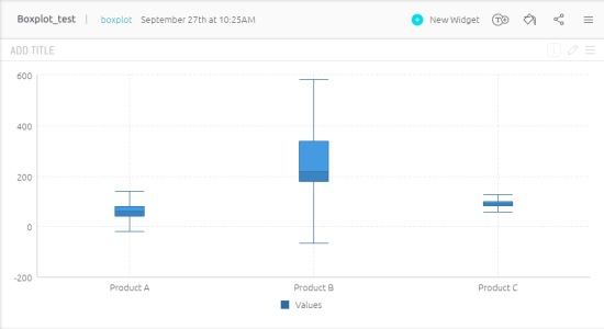
Box & Whisker Plot
The Box & Whisker Plot, or Box Plot, widget is a convenient way of visually describing the distribution, variability, and center of a data set along an axis.
Box Plots are divided into four quartiles. The middle quartiles are represented by a box that contains 50% of the data and the median value. The upper and lower quartiles contain the maximum and minimum values and the remaining 50% of the data. These quartiles are represented by lines called whiskers.
The maximum and minimum values can be adjusted when defining your box plot. By default, these values are within 1.5 times of the IQR (Interquartile Range), however you can set them to the actual maximum and minimum values or to within one standard deviation of the mean of your data.

Box plots divide five descriptive statistics into four equal quartiles. You can view these statistics by hovering over the Box Plot.

For a short video overview of the Box and Whisker plot, see below.
Adding Data
-
In the Categories panel, click Add + to select the field whose values will be placed on the X-Axis. The X-Axis of a box plot is used to represent numeric data.
-
In the Values panel, click Add + to select the field whose values will be placed on the Y-Axis.
Design the Box Plot
You can fine tune the appearance of the Box Plot widget with the following tools.
-
Whisker Values: Defines how the whiskers are calculated and displayed.
- IQR (Interquartile Range): Default setting. The whisker values are calculated within 1.5 times the IQR (the difference between the 1st and 3rd quartiles).
- Extremums: The whiskers' values include the maximum and minimum values in the calculation.
- Standard Deviation: The whiskers' values are calculated to one standard deviation above and below the mean of the data.
-
Box: Specify whether to display a full or hollow box.
-
Value Labels: Specify whether to show or hide labels indicating the values of each point (circle). Select the orientation of these labels: Horizontal (Default), Diagonal or Vertical.
-
Legend: Specify whether to show or hide the Legend, and select its position.
-
Show Outliers: Specify whether to show or hide labels indicating the values of each point (circle). Select the orientation of these labels: Horizontal (Default), Diagonal or Vertical.
-
X-Axis and Y-Axis:
- Grid Lines: Shows (Default) / hides.
- Labels: Shows (Default) / hides.
- Title: Select the checkbox to display the axis title. To edit the title, type in a new title. Click outside the text box to apply the new value. To change the default minimum, maximum or interval values on the axis, type in the new values, and click outside the text boxes to apply the new values.
- Values on Axis: To restore any of the values to their default states, click the reset button.
-
Auto Zoom: When a widget contains more data than can comfortably be displayed in one view, Auto Zoom will resize the chart to include more data, and in some cases adds a zoom bar under the widget. The zoom bar enables you to scroll right and left and to zoom in/out of different parts of the width of the widget.