Line Chart
Last updated: June 11, 2026
| Tier | Deployment |
|
|
|
The line chart can be used for various business cases, including:
- Comparing data over time, for example: to analyze sales revenue for the past year.
- Comparing changes over the same period of time for more than one group or category. Example: Analyze expenditures of different business units for the past year.
Adding Data
-
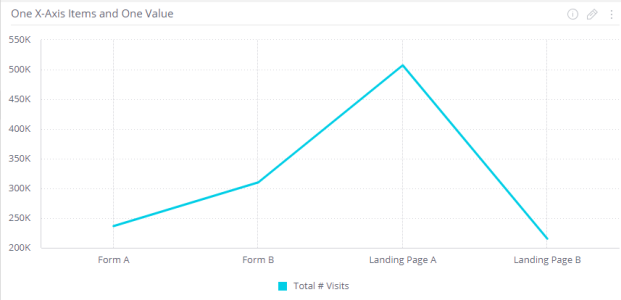
Add data to the X-axis.
Click Add + to select the field(s) that will be represented on the X-Axis.
Typically, the x-axis of a Line chart is used to represent time.
You must add at least one item to the x-axis, and at most, two items.
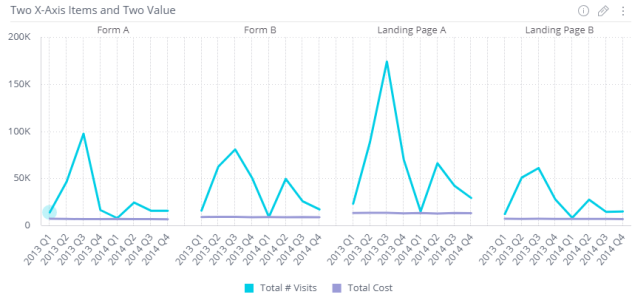
When you add two x-axis items, the chart's x-axes are combined and a separate plot (line) is displayed for each unique value of the second selected x-axis.
-
Add data to the Y-axis.
In the Values area, click Add + and select the field whose value determines the height of the lines in the chart. Typically, the Y-Axis of a line chart is used to represent numeric data. You must add at least one field. If you add more than one field, then each item is represented in the chart by its own line and color.
Another version of the same chart includes the following differences:
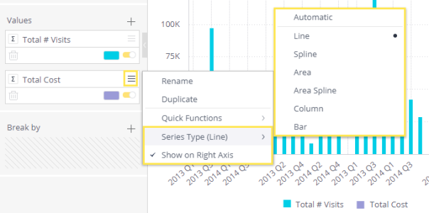
- The second value has been changed into a column chart.
- The second value has been added to the right axis. This is a useful option when the values are using a considerably different scale.
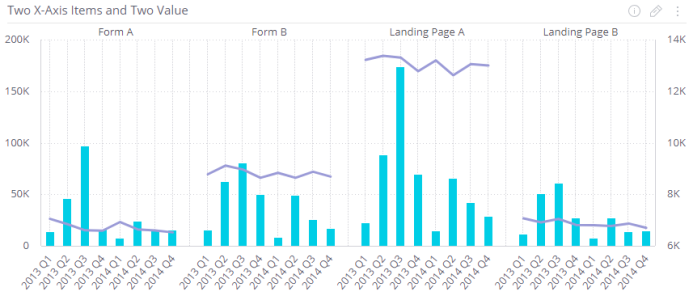
Both options are available by right-clicking on the value.
-
(Optional) Select a field by which to break up the data. Click Add +.
Each item that is a member of the field added to Break by is represented by its own line in the chart, and is automatically added to the chart's legend.
You can add only one Break by field.
The Break by option is only available when you have a single field in the Y-Axis.
Designing the Line Chart
Fine-tune the appearance of the line chart, using the following tools:
- Line Width: Select either Thin, Bold (default) or Thick.
- Line Type: Select how the line appears in the widget: Straight (default) or Smooth.
- Legend: Toggle the legend on or off, and select its position in the chart.
- Value Labels: Toggle labels on or off, and define how labels are displayed: Horizontal, Vertical or Diagonal.
- Markers: Select whether to show or hide markers over data points. Select Full or Hollow, and Small or Large markers.
- X-Axis:
- Grid Lines: Show (default) or hide grid lines.
- Labels: Show (default) or hide labels.
- Title: Select the check box to display the x-axis title. To edit the title, type in a new title. Click outside the text box to apply the new value.
- Values on Axis: To change the default minimum, maximum or interval values on the axis,
type in the new values, and click outside the text boxes to apply the new values. To restore any of the
values to their default states, click on the Reset button.

Note:
Long X-axis labels may be truncated.
- Y-Axis:
- Grid Lines: Show (default) or hide grid lines.
- Logarithmic: Displays a logarithmic scale instead of a linear scale on the axis.
- Labels: Show (default) or hide labels.
- Title: Select the check box to display the y-axis title. To edit the title, type in a new title. Click outside the text box to apply the new value.
- Values on Axis: To change the default minimum, maximum or interval values on the axis,
type in the new values, and click outside the text boxes to apply the new values. To restore any of the
values to their default states, click on the Reset button.
- Auto Zoom: When a widget contains more data than can comfortably be displayed in one view, Auto Zoom will resize the chart to include more data, and in some cases adds a zoom bar under the widget. The zoom bar enables you to scroll right and left and to zoom in/out of different parts of the width of the widget.