Selecting Colors in Widgets
Last updated: June 11, 2026
| Tier | Deployment |
|
|
|
Different field values are represented by different colors. The Widget Designer automatically assigns these colors and displays them in the widget legend that is displayed in the Widget Designer and in the dashboard.
The Widget Designer provides the following options for manipulating these colors:
- Single Color: For selecting a specific color for all values
- Range: For selecting a range of colors
- Conditional: For defining colors based on conditional data.
Selecting a Specific Color - Single Color Tab
The following procedure describes how to assign a specific color to a data value that does not change. This color only applies to the widget in which it is defined.
To select a specific color:
-
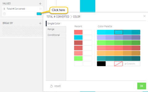
Click on a color in the Widget Designer Data Panel to display a color picker window.
-
Select the Single Color tab.
-
Select a color and click OK.
Note:
To select a custom color that does not exist in the palette, enter a hexadecimal value into the # Custom field.
Selecting a Range of Colors - Range Tab
The Range tab is available for the following widgets:
- Column Chart and Bar Chart
- Scatter Map and Area Map
The following procedure describes how to assign a range of colors to a field according to its value.
To select a color range:
-
Click on a color in the Widget Designer Data panel to display a color picker window.
-
Select the Range tab.
-
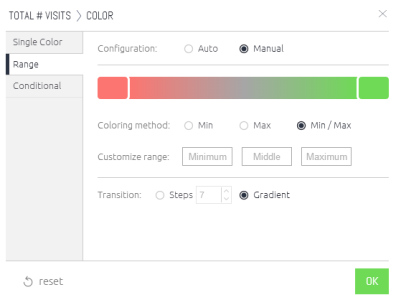
By default, the range configuration is set to 'Auto', which automatically assigns a color range.
Select Manual to manually configure the color range, as follows:- Change Left/Right Colors: Click the color rectangles at the right and left to change the start and end color of the range.
- Customize Range: By default, the color range is set to match the minimum and maximum values of the data. Instead, you can manually set a minimum value. All values that are below this value will be assigned to the color on the left. Accordingly, selecting a Max value means that all values larger than it will be assigned the color on the right. By default, the 'Middle' color is gray. All values larger than this will start gradually getting the right color. All values smaller than this will start gradually getting the left color. Changing the 'Middle' value controls which value the color gray is assigned to.
- Coloring Method: Selecting Min/Max will display the full color range. Selecting Min will display all the colors between the minimum and middle values, and higher than the middle value will be gray. Selecting Max will display all values between the middle value and the maximum value, while all other values will be displayed in gray.
- Transition: Select Steps to define a distinct number of colors in the range. Select Gradient for a linear color range.
Defining Conditional Coloring - Conditional Tab
Define colors based on the value of the field as defined by a logical expression.
In addition, for Indicator widgets, you can also define whether an icon appears in the widget and select the icon's color. For example, you can define a red arrow pointing downwards for a negative value.
For a short video overview of conditional coloring, see below:
To set conditional coloring:
-
Click on a color in the Widget Designer Data panel to display a color picker window.
-
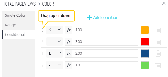
Select the Conditional tab. Each row in this window represents a condition to which you can apply a value. If the condition is true, then that value is shown in the color that you select in this row. For example, one row can state that a negative value is displayed in red and another row can state that a positive value is green.
-
In each row, define an expression to be applied to the value of this field by selecting an operator and specifying a value, as shown below.
-
Select a color for the field.
-
If required, add and define additional condition rows by clicking + Add condition.
-
In the dashboard, these conditions are evaluated in the order in which they appear in this window - from top to bottom. The first condition that is true, determines the color. Reorder the condition rows as necessary by dragging them up or down.
-
Click OK.