Indicator
Last updated: June 11, 2026
| Tier | Deployment |
|
|
|
The Indicator widget provides various options for displaying one or two numeric values as a number, gauge or ticker. It also provides the option to add additional titles and a color-coded indicator icon representing the value, such as a green up arrow or a red down arrow.
For a short video overview of indicators and gauges, see below:
Adding Data
-
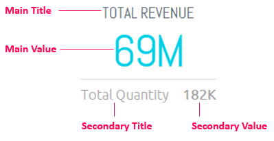
Click Add + in the Value panel to select one field whose name and value will be shown as the Main Title and Main Value, as shown below.
-
Click Add + in the Secondary panel to select one field whose name and value will be shown as the Secondary Title and Secondary Value, as shown below.
Numeric Indicator
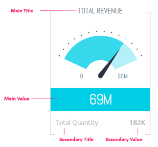
Gauge Indicator
-
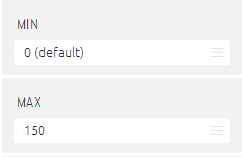
For a gauge, select the minimum and maximum values that can be represented by the gauge. These values can either be set as a fixed numeric value that you specify or as another numeric field that you select using the Data Browser (thus making the value dynamic).
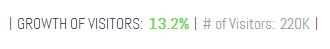
In an Indicator widget, you can also define whether an icon appears in the Widget and the icon's color. For example, you can define a red arrow pointing downwards for a negative value. Find more information in Customizing the Dashboard Layout, under Selecting Colors in Widgets.
Designing the Indicator
Fine-tune the appearance of the Indicator widget, using the following tools:
- Indicator Type: Select whether the Indicator appears in Numeric form or as a Gauge.
.png)
|
1.png)
|
| Numeric | Gauge |
Note:
If you significantly shorten the height of an Indicator widget in the dashboard, it automatically turns into a Ticker type Widget. Find more information in Customizing the Dashboard Layout, under Working with Ticker Widgets.
- Skin: Select the skin of the gauge.
- Components: Select which labels to include in the widget.
- Indicator Sub Type: (for numeric indicator only): You can choose a another skin option.