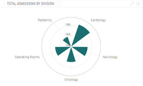
Polar Chart
Last updated: June 11, 2026
| Tier | Deployment |
|
|
|
Use the polar (radar) chart to compare multiple categories/variables with a spacial perspective in a radial chart.
Adding Data
-
ClickAdd +to select the field whose values will be represented as columns in the circle. Each Category gets its own data point.
Typically, the Categories of a Polar Charts are descriptive data.
-
In theValuesarea, clickAdd+to select the field whose values determine the distance of the column from the center of the polar circle. This is typically used to represent numeric data.
When you select more than one value, they are stacked on top of each other.
-
Select a field by which to break (group) the data in this chart by clickingAdd +.
Each field added to Break by is represented by its own column and color in the chart and is automatically added to the chart's legend.This is an optional field. You can add at most oneBreak byfield. TheBreak byoption is available only when a single field was added toValues(Y-AXIS).
Designing the Polar Chart
Fine-tune the appearance of the Polar Chart widget, using the following tools.
- Polar Type:Select the type of chart.
- Legend:Specify whether to show or hide the LEGEND, and select its position.
- Value Labels:Specify whether to show or hide labels indicating the values. Select the orientation of these labels:Horizontal(Default),DiagonalorVertical.
- Categories:
- Grid Lines:Shows (Default) / hides.
- Labels:Shows (Default) / hides.
- Axis:
- Grid Lines:Shows (Default) / hides.
- Logarithmic:Displays using orders of magnitude.
- Labels:Shows (Default) / hides.
- Title:Select the checkbox to display the axis title. To edit the title, type in a new title. Click outside the text box to apply the new value.
- Values on Axis:To change the default minimum, maximum or interval values on the axis, type in the new values, and click outside the text boxes to apply the new values. To restore any of the values to their default states, click on the reset button.

Note:
Long X-axis labels may be truncated.
Tip:
For more information, see Conditional Coloring with Scripting in Sisense Polar Bar Charts on the Sisense Community site.