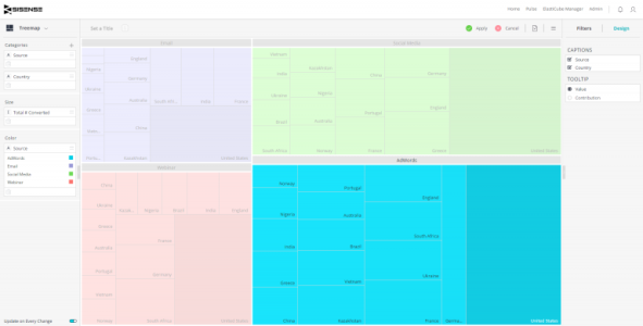
Treemap
The Treemap is a multi-dimensional widget that displays hierarchical data in the form of nested rectangles. This type of chart can be used in different scenarios, for example, instead of a column chart if you have to compare too many categories and sub-categories.

For a short video on treemaps, see below.
Adding Data
-
In the Categories panel, click Add+ to select the fields whose values will be represented as rectangles in the chart.
Typically, the Categories of a Treemap widget contain descriptive data.
You can add up to three fields, so that a rectangle hierarchy is created.
You can reorder the fields using drag and drop.
-
In the Size panel, select the field whose values determine the size of the rectangles by clicking Add +. Values are typically used to represent numeric data.
You can add only one field.
-
In the Color panel, click Add + to select the field to use as the color basis for your rectangles.
The following coloring scenarios are supported:
- Color by a numeric value: If you choose a numeric value, then each rectangle will be colored according to its value in the field's range of values. You can manipulate the coloring rules in the color formatting menu.
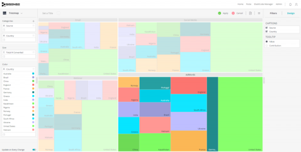
- Color by field members: If you choose a field, then all rectangles that are members of that field will be colored the same. For example, if you choose to color by the field that is also used as the first category, then the entire Treemap will be split into groups of colors, like in the image at the top of this page. If you choose to color by the field that is used as the second category, then all rectangles that share the same value will also share the same color, as in the image below:

Note:
You can only color by a field that is also used in the Categories panel. If you choose a field that is not there, it will be automatically added.
Designing the Treemap
Fine-tune the appearance of the Treemap widget, using the following tools.
- Captions: Control which info is presented in the treemap. A check box will be visible for each field that is used in the Categories panel. Turning a field on/off will determine if the field member name will be visible inside the treemap. Note that this info will always be available in the tooltip when hovering over a rectangle, regardless of the on/off setting.
- Tooltip: Select whether to show the actual value or contribution in the rectangle tooltip when hovering over it.
Treemap Selector
The Treemap can also serve a dual purpose in the form of a selector and contribution visualization. The Treemap can be used as a selector to filter the dashboard by Product Category and show the contribution of that Product Category by number of orders.
Note:
If you choose to use a value in the Treemap with many categories, the Treemap sizes the smaller categories by contribution and this may cause them to be too small to see or select. If you still want to use the Treemap for a selector, just remove the value. The Treemap will show evenly spaced categories.
To create a Treemap selector:
-
Create an Indicator widget.

-
Set the height of the Indicator widget for the Treemap.

-
Edit the Indicator widget. In the Widget Editor, switch the widget type to Treemap.
-
Select Apply. The Treemap will now fit within the bounds of the previously created Indicator Widget.
