Bar Chart
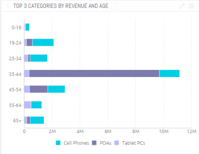
The Bar Chart is commonly used to compare many items. The Bar Chart typically presents categories or items (descriptive data) displayed along the Y-Axis, with their values displayed on the X-Axis. You can also break up the values by another category or groups.

Note:
Long X-axis labels may be truncated.
Adding Data
-
In the Categories panel, click Add+ to select the field(s) whose values will be placed on the Y-Axis.
Typically, the Y-Axis of a Bar Chart is descriptive data. You must add at least one item to Categories, and a maximum of two items. When you add two fields to Categories, the chart's Y-Axis are combined.
-
In Values, select the fields whose values determine the length of each column. Typically, the values of a Bar Chart are used to represent numeric data.
You must add at least one field to Values. When you add more than one value, each item is represented in the chart by its own color and area.
-
(Optional) Select a field by which to break (group) the data represented in this chart by clicking Add +.
Each group is represented by a different column and is automatically added to the chart's legend.
Break by is optional, and operates under the following conditions:
- You can add at most one Break by field.
- The Break by option is available only when a single field was added to Values (Y-AXIS).
- You can only add a single field to Values if the Break by option was used.
Designing the Bar Chart
Fine-tune the appearance of the Bar Chart widget. The design options are the same as for Column Chart.
Additional options to customize the design of the Bar Chart are available from the Sisense user community. An example of how to sort stacked Bar Chart by category total (rather then by Y-axis values, the default sorting) is shown here.