Sankey Chart
Last updated: September 23, 2026
| Tier | Deployment |
|
|
|
A Sankey chart visualizes the flow and volume of data as it moves between categories, or nodes. The width of each connecting line, or link, is proportional to the value it represents, so the largest flows are immediately visible. Sankey charts are ideal for showing how a total splits, merges, or moves across multiple stages, such as how leads flow from country to marketing source or how a budget is allocated across departments.
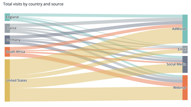
Adding Data
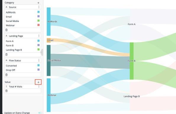
To add data to a Sankey chart, use the following panels:
-
Category: Add at least two descriptive fields to define the stages (nodes) of the flow. When you add more than two fields, Sisense chains the flow across each field in sequence (for example, Source > Landing Page > Flow Status), showing how records move from one stage to the next.
-
Value: Add exactly one numeric field to determine the width of the links between nodes. Unlike other charts, Sankey charts don't support multiple values or Break by.
-
Filters: Apply dashboard filters to the widget as you would to any other widget.
In the following example, Category contains three fields (Source, Landing Page, and Flow Status), and Value contains Total # Visits:
Designing the Sankey Chart
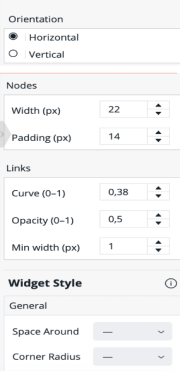
When you edit a Sankey chart, the Design panel provides the following options:
-
Orientation: Choose whether the flow runs Horizontal (left to right) or Vertical (top to bottom).
-
Nodes: Set the Width and Padding (in pixels) of the node bars to control how thick they are and how much space separates them.
-
Links: Control how the flow lines between nodes are drawn:
-
Curve: Set how curved the links are. A value of 0 renders straight lines; higher values increase the curve.
-
Opacity: Set how transparent the links are.
-
Min width: Set a minimum link width, in pixels, so that very small flows remain visible.
-
Exploring the Sankey Chart
Sankey charts support the same interactions as other Sisense widgets:
-
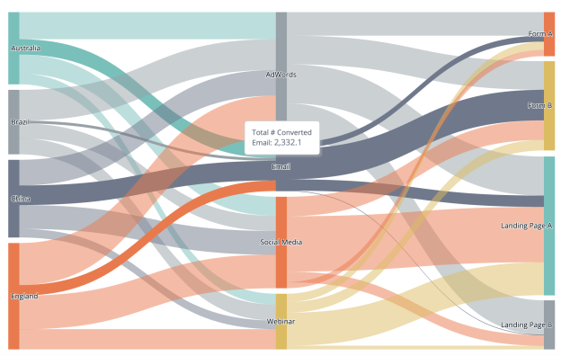
Tooltips: Hover over a node to see its total value, or hover over a link to see the value of that specific flow between its two connected nodes.
-
Selection and cross-filtering: Click a node or link to highlight its related flows and, if enabled, filter other widgets on the dashboard.
-
Drill down: Drill into a node as you would any other chart element, including with Drill to Anywhere. For more information, see Drilling Down in a Widget.
Examples:
Hovering over the Email node highlights every flow through it and shows its total:
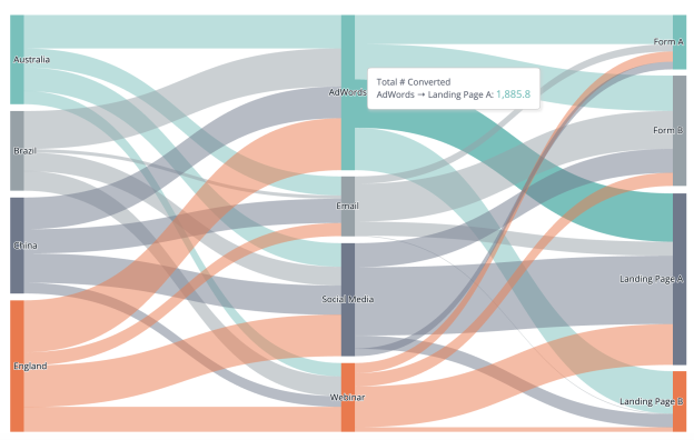
Hovering over a single link shows the value of just that flow (AdWords > Landing Page A):
Exporting and Embedding
As with most other widgets, you can download a Sankey chart as an image (PNG) or to CSV, and add it to Pulse. You can also embed it via iFrame or Compose SDK.
Note:
You cannot edit the widget script for this widget type.
Use Cases
Sankey charts work well whenever you need to show how a quantity moves, splits, or converts across multiple stages, such as:
-
Budget and cash-flow allocation across departments
-
User journeys and conversion funnels, from acquisition source to landing page to conversion
-
Source-to-target transfers, such as freight or logistics volume between locations
-
Supply chain, material, or energy flow between sources and destinations
-
Patient pathways through stages of care
-
Attribution modeling across marketing channels