KPI Chart
Last updated: September 23, 2026
| Tier | Deployment |
|
|
|
A KPI chart combines a single headline metric, a period-over-period (or target) comparison, and a historical trend sparkline in one widget. Previously, showing a number alongside its trend meant building two widgets: an Indicator for the value and a separate line or column chart for the trend, kept in sync by hand. The KPI chart consolidates both into a single, configurable card and is intended to eventually replace the classic Indicator widget.
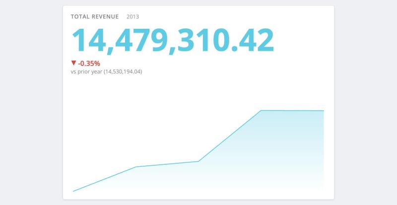
The following KPI card shows a headline value, a comparison against the previous period, and a trend sparkline:
Adding Data
-
Value: Add exactly one numeric field. This is the headline number the card is built around. The field's color menu applies here: choose a single color, or a conditional rule that colors the headline based on its value.
-
Category (Sparkline): Add one field, typically a date dimension. Adding a category enables the sparkline, the current-period caption beside the title, the Based on setting, and the Previous period comparison. Category is optional: without it, the card shows the value on its own, and the Sparkline section is removed from the Design tab. You can also use a non-date category (for example, a text field); the card then labels each point with its text instead of a formatted date.
-
Target (Goal) and Comparison Value: The Design tab determines which of these two panels appears, not the other way around. Choose the comparison first (see Comparison), and the panel it requires appears. Comparison Value is a standard measure drop target. Target (Goal) is a fixed number that you edit in the formula editor instead of dragging a field onto it. It is pre-filled with a placeholder, and until you replace it, the card intentionally displays no comparison.
-
Filters: Apply dashboard filters to the widget as you would for any other widget.
Designing the KPI Chart
You configure every aspect of the card on the widget editor's Design tab, where settings are grouped by the part of the card they affect. Controls that would have no effect in the current configuration are hidden rather than disabled, so the options you see depend on the fields you added on the Data tab and the comparison you chose.
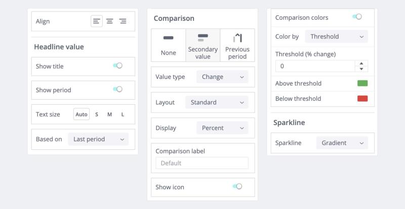
The following image shows the Design tab for a KPI chart, arranged in three columns (read top to bottom, left to right). Comparison type is set to Secondary value and Value type to Change, the configuration that exposes the most controls:
Align
Aligns the whole card, including the title row, to the left, center, or right. This is the only card-level control in the KPI panel itself. Corner radius, border, and shadow come from the generic Widget Style section further down the same tab, which all Fusion widgets share. That section's Background setting is the exception: it colors the widget frame behind the card, which the card paints over, so it has no visible effect on a KPI chart (see Theming).
Headline Value
-
Show title: Shows or hides the card's title, which defaults to the name of the value measure. You cannot edit the title text here; rename the widget to change it.
-
Show period: Shows or hides the current bucket's caption next to the title. For a date category, this is a formatted period; for a non-date category, it is the bucket's own text. Available only when a Category is added and the title is shown.
-
Text size: Select Auto (scales to fit the card) or one of three fixed presets: S, M, or L. You cannot set a custom pixel value.
-
Based on: Determines whether the headline number covers the Last period in the range or the Whole period. Available only when a Category is added, since without one both options display the same number.
Comparison
-
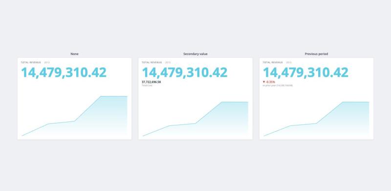
Comparison type: What the headline is measured against: None, Secondary value, or Previous period (requires a Category).
-
Value type: For a Secondary value, determines how the second measure is interpreted:
-
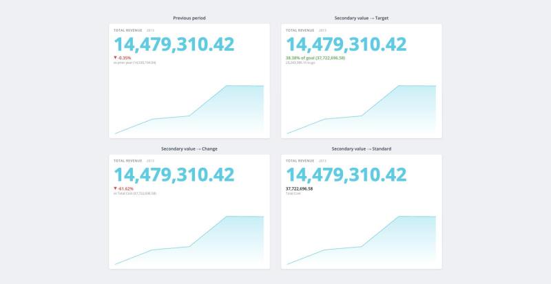
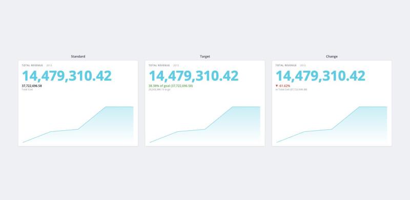
Standard: Displayed as-is beside the headline, with no delta calculation.
-
Target: Progress toward a goal, for example, "38.38% of goal, 23,243,386.15 to go."
-
Change: A signed delta, for example, actual vs. budget.
-
-
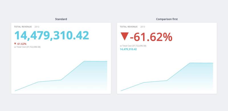
Layout: Standard places the value in the headline and the comparison beneath it. Comparison first swaps the two, which is useful when the change matters more than the absolute number. Hidden when Comparison type is None, since both options would produce the same card.
-
Display: Whether the comparison appears as a Percent, a Value, or Both. Not available for a Standard secondary value, which performs no calculation.
-
Comparison label: Overrides the caption displayed beside the comparison (for example, "vs prior year" or "vs Total Cost"). Not available for a Target, whose wording comes from the Of goal text and To go text fields instead.
-
Of goal text and To go text: Target only. Replace the two localized default captions with your own templates, using the
{{percent}}and{{value}}tokens. -
Show icon: Shows or hides the up/down arrow. Available only for the two delta-based readouts, Previous period and Change. A Target reports progress rather than direction, so it has no arrow.
-
Comparison colors: A toggle that, when enabled, displays the Color by setting:
-
Threshold: Sets one number, with a separate color on each side of it: Above threshold and Below threshold. The threshold field is named for the metric it uses, because the two readout types measure differently: Threshold (% change) for a delta-based comparison, where 0 means no change, and Threshold (% of goal) for a Target, where 100 means the goal is reached.
-
Single color: Uses one color regardless of the data.
When the toggle is off, the comparison uses the card's plain text color. The Comparison colors group is not available for a Standard secondary value, which takes its color from its own measure.
-
The following image shows the four comparison readouts. The text beneath the headline, and the Data tab panel it reads from, depend on the Comparison type and Value type:
The following image shows the three Comparison type options. None shows the value on its own. Secondary value reads a second measure, shown here with its default Standard value type. Previous period compares the last bucket with the one before it:
The following image shows the three Value type options for a Secondary value. Standard shows the second measure as-is, Target reports progress toward a goal, and Change reports a signed delta. Target is shown with Display set to Both, which adds the to-go line:
The following image shows the two Layout options applied to the same Change comparison. Standard leads with the value and places the comparison beneath it; Comparison first promotes the comparison to the headline and moves the value below it. The sparkline is the same in both layouts:
Sparkline
This single control is available only when a Category is added. Select None, Line, Curve, Gradient (the default), or Bars. If you switch to None, the card keeps your previous shape and restores it when you switch back.
Widget Style
This is the standard Fusion widget styling section at the end of every widget's Design tab; it is not specific to the KPI chart and is separate from the KPI settings above. It controls the card frame's spacing (space around), corner radius, shadow, border, and background, and the header's title color, alignment, divider line, and background. It also includes Restore default settings. For more information, see Setting Widget Style.
Theming
The card follows the dashboard's color palette and nothing else. Fusion passes the palette to the chart as its theme, but the card does not inherit fonts, text colors, or backgrounds from the dashboard theme.
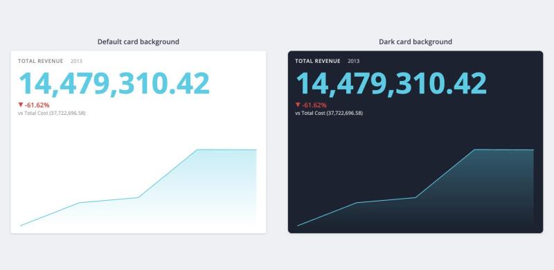
The card background is a style setting rather than a Design tab control. When it is set to a dark color, the card automatically switches its captions to white for contrast. Widget Style > Background is a separate, frame-level setting that the card paints over, so it does not darken a KPI card on its own.
The following image shows the same card with the default background and with a dark card background. The title caption and the comparison line automatically switch to white, while the palette-driven headline and sparkline colors stay the same:
Exploring the KPI Chart
-
Tooltips: Hover over a point on the sparkline to see its value and period.
-
Filters: The KPI chart responds to dashboard filters like any other widget.
-
No cross-filtering: The card does not create selections. Clicking it does not filter the rest of the dashboard, and you cannot use it as a cross-filtering source.
Exporting and Embedding
From the widget menu, select Download > Image or Download > CSV File. Like every other widget, the card is also included in dashboard PDF exports and in Pulse. Embed snippets work the same way as for other widgets.
Because the card is rendered with Compose SDK, it behaves the same whether you view it on a dashboard, embed it, or render it by ID through Compose SDK.
Use Cases
KPI charts work well wherever a single number needs to be shown with its trend and a point of comparison, for example:
-
Executive summary tiles: revenue, active users, or NPS with month-over-month change
-
Progress toward a goal: pipeline vs. quota, or tickets closed vs. target
-
Actual vs. budget or plan comparisons
-
Operational health metrics with a short historical trend (uptime, error rate, churn)
-
Replacing pairs of Indicator and trend chart widgets with a single card that is easier to maintain