Customizing the Sisense User Interface
Last updated: June 11, 2026
| Tier | Deployment |
|
|
You can customize the look and feel of your Sisense user interface, and preview your changes so that you can see what your customizations look like before you implement them.
Customization options are:
- Typography: Select system fonts or upload custom fonts, which will be used across Sisense in dashboards, widgets, navigational elements, and system pages:
- Custom fonts: TTF format is supported and there is a size restriction of 1MB per file
Note:
It is recommended to use Google fonts or other credible web font libraries.
- Background Color: Set background color across the application. The color setting applies to the main header, tables, panels and the application background
- Dashboard and Widget Design Settings: Make changes to the design of your dashboards and widgets
Modals, popups, popovers, and drop-downs stay in the default styles (the Sisense Default Theme), except for the font family, brand color, and non-transparent buttons.
If you want to add your own branding to Sisense, see White Labeling Sisense. White labeling is a premium feature.
Watch this video for an explanation and demo of customizing the look and feel of the user interface:
To get started with changing the look and feel of your application, open the Admin page, and search for and select Look and Feel which is located under App Configuration.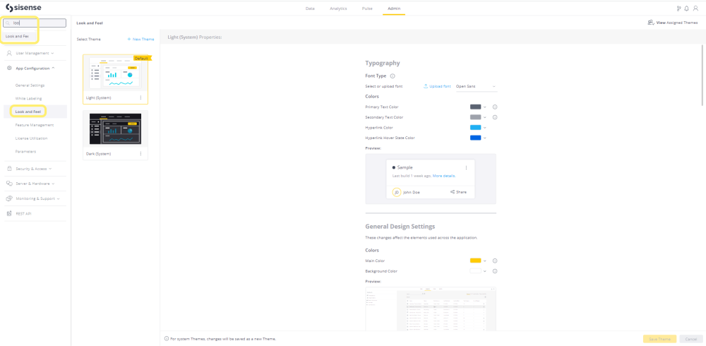
Changing Fonts
- To use one of the available system fonts, in the Typography section, select it from the drop-down list. The font is applied across Sisense in dashboards, widgets, navigational elements, and system pages.
- To upload your own custom font, click Upload Font.
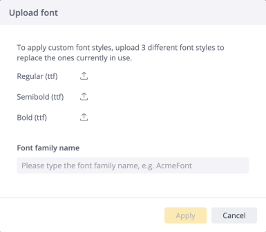
- In the Upload font window, click each arrow to upload the font style. You must upload the three different font styles. Each style helps with correct formatting of text in the user interface.
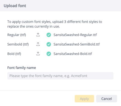
- Enter the font family name and click Apply. After the font has loaded, it can be selected and applied as part of a theme.
- Select colors for primary and secondary text, and hyperlinks. You can do this in one of three ways:
- Use the color picker to select a color (A)
- Enter the HEX color value (B)
- Select a color from your list of favorites (C)
To add the selected color to your list of favorites, click +.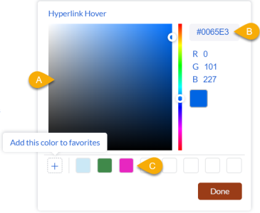
Favorited colors appear in all color pickers on the Look and Feel page.
Background Color
Note:
This feature is only available on Sisense for Linux version L2021.1 and above.
In the Background Color section, you can change the background color of:
- The tabs at the top
- Login, activation, recovery password page, error page and internal white space
- Pulse page
- Data Page Navigation elements
- Admin page
To change the background:
- Select a color. You can do this in one of three ways:
- Use the color picker to select a color (A)
- Enter the HEX or RGB color values (B)
- Select a color from your list of favorites (C)
- To add the selected color to your list of favorites, click +.

Favorited colors appear in all color pickers on the Look and Feel page.
Dashboard and Widget Design Settings
The settings below are for Administrators to set the system-wide default settings for the appearance of dashboards and widgets.
If an Administrator has enabled the option in Admin > Feature Management > Widget Design Styling, widget design settings can also be set by Dashboard Designers for individual widgets. For more on setting these customizations by Dashboard Designers, see Setting Widget Style.
- Use the following settings to design your dashboards and widgets (read the tooltips for important guidance). When you make a change, the Preview displays how the selected options appear once you apply them:
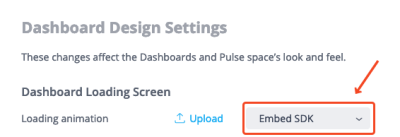
- Dashboard Loading Screen -
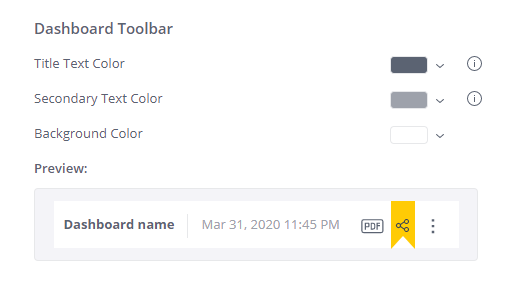
- Dashboard Toolbar - Set the dashboard text and background colors.
- Dashboard Style - Set the appearance of the widget background color, borders, and the spacing between them.
Note:- It is recommended to define spacing between widgets if the corner radius or shadow are applied.
- The background color will not be visible if the spacing between widgets is set to “None”.
Compare the two images below to see the effects of these settings.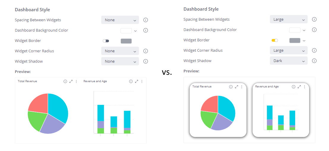
- Widget Header Style - Set the widget header text and background colors, as well as the title alignment and divider line.
- Note: Alignment to center is not recommended for long titles or small widgets, as the text may not be fully displayed.
Compare the two images below to see the effects of these settings.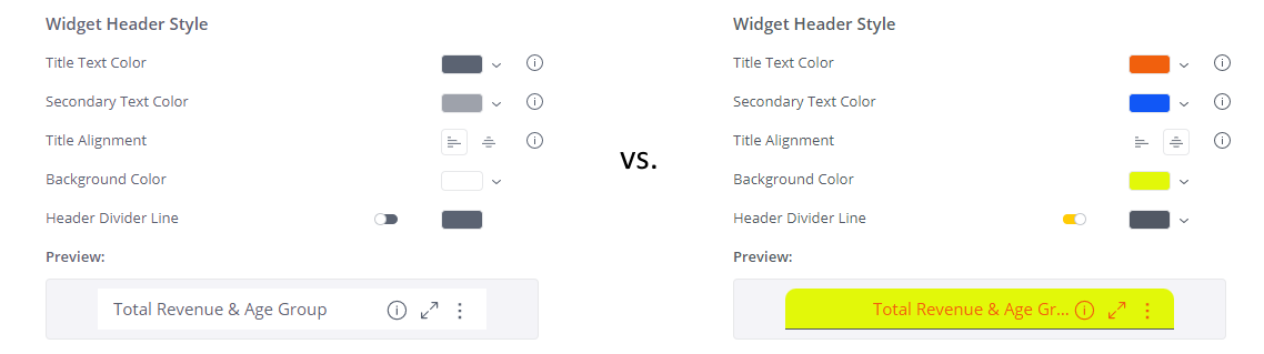
- Note: Alignment to center is not recommended for long titles or small widgets, as the text may not be fully displayed.
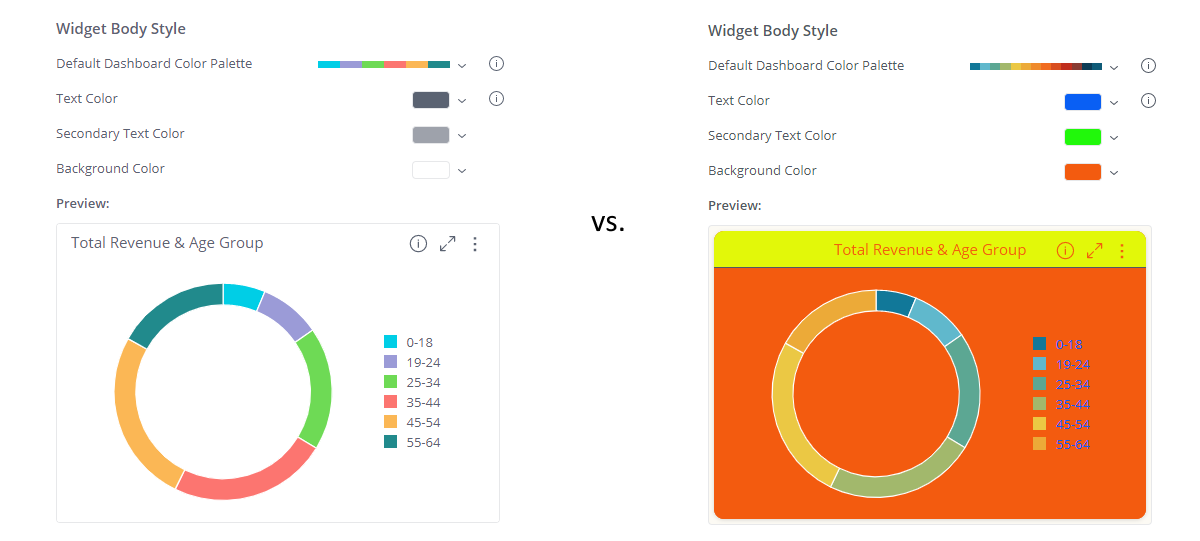
- Widget Body Style - Set the widget colors. Compare the two images below to see the effects of these settings; the differences reflect both the body styles changed here, as well as the header styles changed above.
Limitation:
The custom dashboard loading screen is not applied for organization tenants as part of the Look & Feel theme.Workaround:
You can copy theloading-screensfolder from system tenant folder/opt/sisense/storage/tenants/{SystemTenantID}into the custom tenants folders. This can be done either by SSH or by using the FileManager (for which the folder location istenants/{SystemTenantID}).For more information, see Self-contained Multitenancy configuration.
To change the dashboard loading animation screen to any other animation that is available in the instance, select it from the drop-down and save the theme.
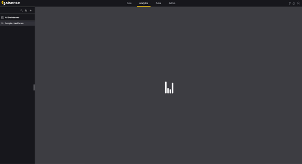
A new dashboard loading screen loading animation will be applied to all of the relevant users in this environment or embedded solution. This animation is applied to the general dashboard loading screen - the individual widgets loading indicators remain unconfigurable.
In order to upload a new dashboard loading animation, click [ Upload ], select the SVG file, enter a unique name, and click [ Apply ]. Once it is successfully uploaded - the loading animation can be selected in any other Look and Feel theme on the instance.
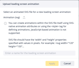
SVG is the only supported format for the dashboard loading screen animation.
To delete the existing loading animation - open drop-down list with loading animation in any theme, click [ Trashcan icon ], and confirm deleting the animation.
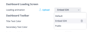
Deleting a dashboard loading animation will affect all of the Look and Feel themes where it has been selected. There is no ability to undo/restore a deleted loading animation. If the theme's currently selected loading animation is deleted, the system default loading animation will be automatically selected instead.
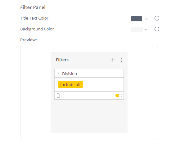
- Select the title text color and the background color for the filter panels.
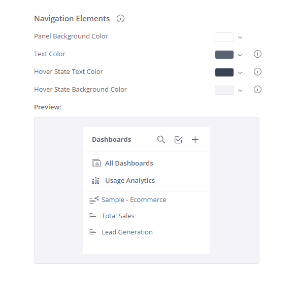
- Select the colors for navigation elements that display across Sisense.
- To apply all changes, at the bottom of the page, click Save Theme.
- To revert to default settings, at the bottom of the page, click Restore to default, and confirm.
Working with Themes
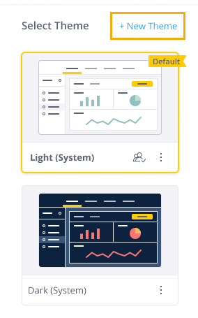
You can create a new theme from a System theme, from an existing theme, or as a brand new theme.
Creating a Theme from a System Theme
You can create a theme by changing the properties of a System theme. When you save, you’re prompted to name your theme. A thumbnail of the new theme is displayed in the Select Theme panel.
Creating a New Theme
- In the Select Theme panel, click + New Theme.
- Enter a name for your new theme.
- If you want to base your new theme on an existing one, select a theme from the dropdown list.
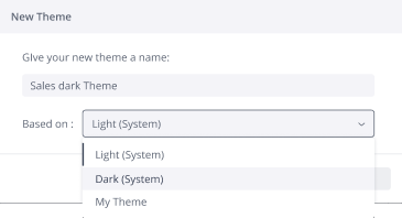
- Click Create Theme. The new theme’s thumbnail appears in the Select Theme panel.
- Make the required changes to the properties of the duplicated theme.
- To save your changes, click Save Theme.
Creating a Theme from a Duplicate Theme
If you would like to create a new theme that is similar to a theme you already created, you can duplicate the existing theme and then make changes to its properties.
To duplicate a theme:
- In the Select Theme panel, select the theme you want to duplicate.
- On the theme thumbnail’s menu, select Duplicate.
- By default, duplicated themes have the same name as the original theme with “(Copy)” appended to it. You can rename the duplicated theme to differentiate it from the original. To do so, click the duplicated theme’s thumbnail menu and select Rename.
- Make the required changes to the properties of the duplicated theme.
- To save your changes, click Save Theme.
Assigning a Theme to a Group
You can assign a theme to a Group. When you do, all members of that group will experience Sisense with that theme.
To assign themes to a Group:
- In the Look and Feel page, in the top-right corner, click Assigned Themes. A list of all themes assigned to groups displays.
- If an entry includes more users than will fit, mouse over the entry. The tooltip lists additional groups with that theme assigned to them.
- Click Group Management.
- On the entry for an existing group, click to edit it and assign a theme, or click Create Group to create a new group and assign a theme to it.
For details about assigning themes to group, see Managing User Groups.
Assigning Theme to a User via SSO Configuration
A Look and Feel theme can be assigned to the SSO-created users by passing a theme ID in the claim “themeId”. In such cases the user will experience Sisense with their assigned theme, regardless of any group or default theme settings.
Additional Actions
In the Look and Feel page, you can perform the following additional actions:
- Search for a theme: If you have multiple themes and you want to find a specific one, in the top-right corner, click .
- Rename a theme: To rename a theme, click the relevant thumbnail’s menu and select Rename.
.png)
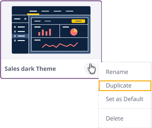
- Duplicate a theme: To duplicate an existing theme, click the relevant thumbnail’s menu and select Duplicate.
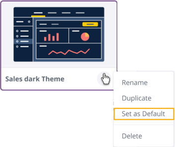
- Set a theme as default: Default themes are used for users who are not associated with any groups, and for users who are not associated with a specific theme. To set a theme as default, click the relevant thumbnail’s menu and select Set as Default.
 You can also set a theme as default by clicking Set as Default Theme at the bottom of theme properties.
- Delete a theme: To delete a theme, click the relevant thumbnail’s menu and select Delete.
Note:
- If you attempt to delete a default theme, you’ll be prompted to select a new default theme before continuing.
- If you delete a theme that is assigned to a Group, users in that Group will experience Sisense with the default them.
Copying a Theme Identifier
You can apply a theme by copying the theme ID and adding it to the code to make modifications to the visuals on your server. For example, you can apply a theme to specific groups, or when embedding Sisense components in web pages, you can use the theme to make visual changes to pages.
- Select a theme, right-click the action buttons and select Copy Theme Identifier. The ID is copied to the clipboard.
.png)
- Paste the ID into any text or code editor.
- Copy the code as a parameter into your environment. When it is applied, the pages display with the theme visuals.
Customizing the Sisense User Interface with the REST API
In addition to the interface Sisense provides for customizing the UI, you can customize it through the Sisense REST API. The options are available in REST API 1.0 /themes.