Adding Widgets to a Dashboard
This topic describes how to add widgets to your dashboard through the Widget Wizard.
The Widget Wizard automatically guides you through a very simple process of creating a widget, while offering the best recommendations for displaying the data that you select.
Almost always, simply accepting the wizard's recommendations will help you create a great widget. However, if you want more control over your widget's appearance and behavior, click the Advanced Configuration option in the bottom left of the wizard to access a rich variety of additional design options, as described in Designing Widgets.
For a short overview of the process of adding a widget, see below:
Using the Widget Wizard
To add a widget to the dashboard:
- If this is your first widget, click
 .The Sisense Data Browser opens, and from there you can select one of the fields (columns) from this dashboard’s ElastiCube or Live data source. If you already have widgets in your dashboard, then click the
  button.
Note:
To select data from a different ElastiCube, click from on the right side of the New Widget window, and select an ElastiCube.
- You can add a title to your widget now or after creating your widget.
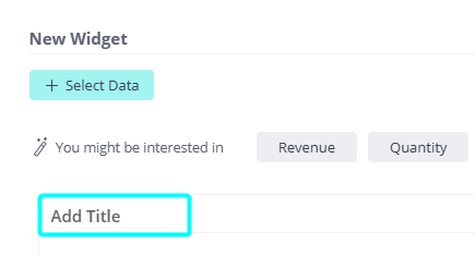
The widget title is limited to 255 characters.
- In the Data Browser, select a field to add to your widget. The field that you select is automatically displayed
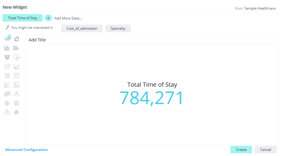
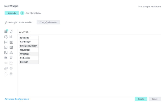
in a suggested widget. When only a single numeric field is selected, it is displayed as an Indicator widget. A
single descriptive field is displayed as a Pivot widget.
Single Numeric Field:
Single Descriptive Field:
But your widget is not really interesting yet, because it has only one field!
Repeat the step above to add more fields to the widget.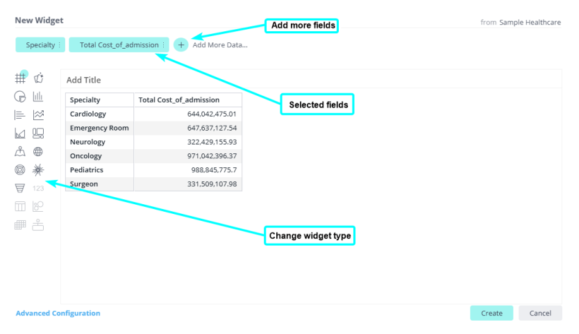
The fields that you select are listed across the top left of the wizard.
Click on each visualization button to display the selected fields in that visualization/chart. For example, the same widget as above can be displayed as a Pie chart: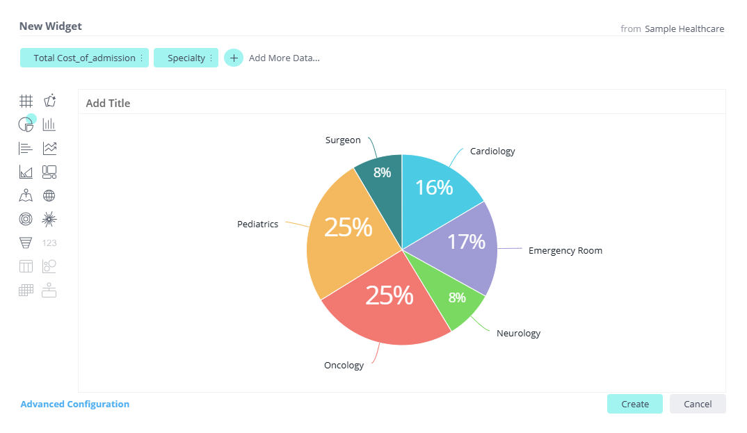
Note:
Sisense provides its best recommendation for your widget design. However, if you want more control, you can click the Advanced Configuration option on the bottom left of the window to provide a rich variety of additional design options, as described in Designing Widgets.
Data Browser
In the Data Browser, you can select and add columns (sometimes called fields) from an ElastiCube or a Live data source to your widget.
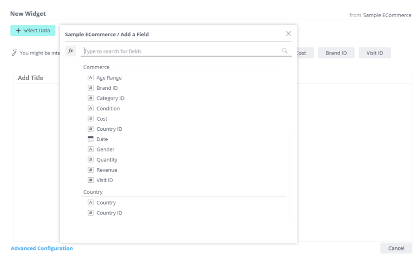
An icon appears to the left of each field to indicate its data type:
-
 Date
Date -
 Alphanumeric string
 -
 Numeric
As you type into the Data Browser, the list is dynamically filtered to only show the fields that contain the text you typed.
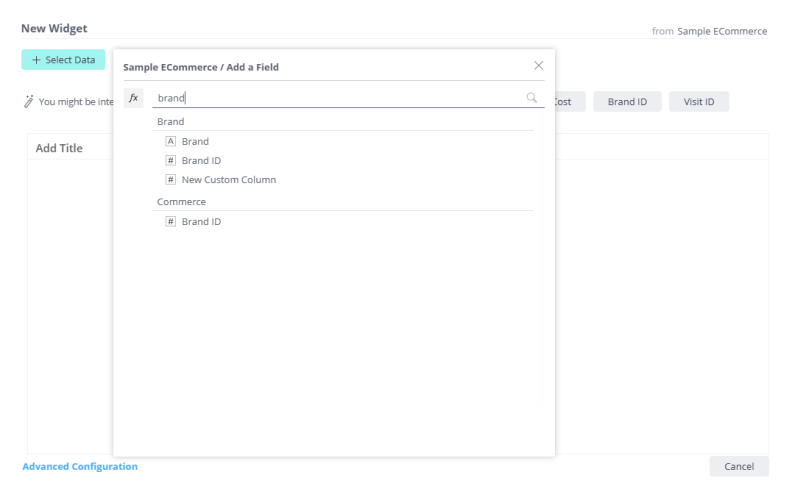
Simply clicking a field to add it to the widget generally provides great results, however there are more options in the Data Browser.
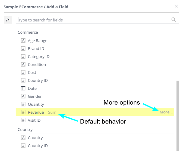
- Hover over a field in the Data Browser and click More ... to display additional aggregation (quick functions) and filtering options.
- Click the
 button to
define formulas (free-form expressions) that define the field values and filters of a widget. Choose from a variety
of functions for your formula.
To learn more about these options, see Creating and Editing a Widget Formula.
Managing Date and Time Fields
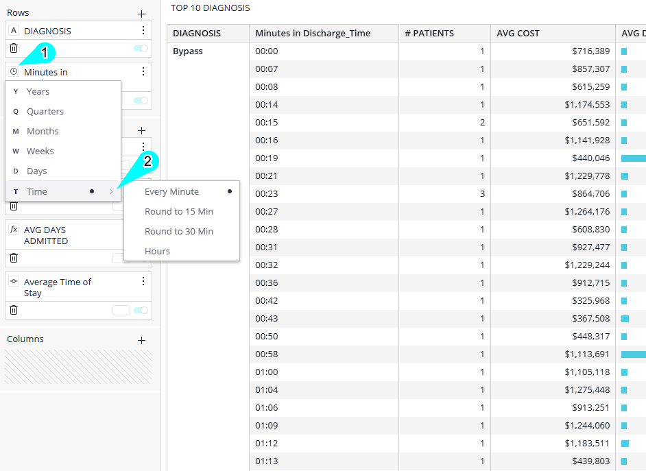
When you create a widget in your dashboard that includes a date field, Sisense automatically breaks the data down by year. You can shorten this to Quarters, Months, Weeks, Days, Hours, and so on.
As an example, for Pivot and Table widgets with live data models, you can set the “continuous” type of breakdown to a granularity of Seconds:
Date and Time Resolution for ElastiCubes
The available time resolutions for ElastiCubes (for all widgets) includes the following continuous and aggregated timeline breakdowns:
-
Continuous (date and time):
-
Years
-
Quarters
-
Months
-
Weeks
-
Days
-
-
Aggregated (aggregation taking into account only the time of day):
-
1 minute periods
-
15 minute periods
-
30 minute periods
-
Hours
-
Note:
For Live Models, a single date field can be formatted to display both date and time in one column within Tables and Pivot Tables. However, this is a known limitation for ElastiCubes. For ElastiCubes, the date and time must be in two separate columns to be displayed correctly in Tables and Pivots.
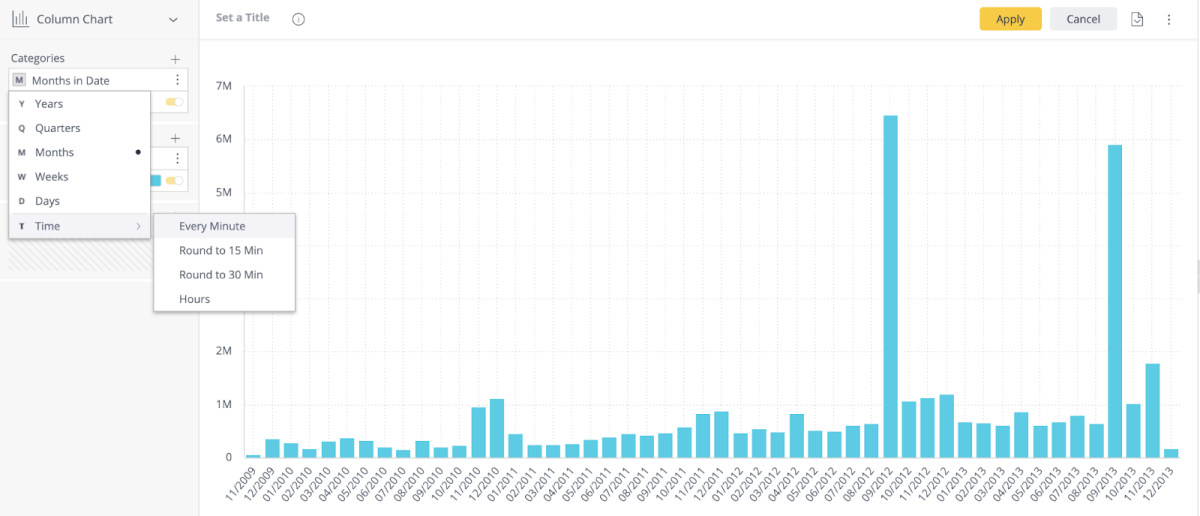
This column chart shows an example of a “continuous” timeline breakdown based on Months.
Date and Time Resolution for Live Models
When the Analytical Engine is used for Live models, time-level support for widgets provides an extended time-level resolution of the data.
For Live models this includes the following continuous and aggregated timeline breakdowns:
-
Continuous (date and time):
-
Years
-
Quarters
-
Months
-
Weeks
-
Days
-
Date & Time (including hours, 30 minute periods, 15 minute periods, 1 minute periods, and 1 second periods).
-
-
Aggregated (aggregation taking into account only the time of day):
-
Time of day: Hour and 15 minute intervals
-
Note:
-
The "continuous" Date & Time options (in the list above) for 30 minutes, 1 minute and 1 second are only available for Tables and Pivot widgets.
-
For Live Models, a single date field can be formatted to display both date and time in one column within Tables and Pivot Tables. However, this is a known limitation for ElastiCubes. For ElastiCubes, the date and time must be in two separate columns to be displayed correctly in Tables and Pivots.
To set the date and time formatting:
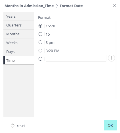
Date and time configurations may be adjusted by clicking the Change how dates are displayed icon
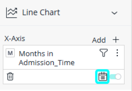
This opens the Format Date window where you can select or specify the format you prefer.
Tip:
For more information, see Show full date format in the pivot or table widget on the Sisense Community site.