Notebook Charts
The SQL and code query results can be visualized as charts for business users. Each cell result can be plotted to a chart.
Adding Charts
Watch this video about adding charts:
To create a chart:
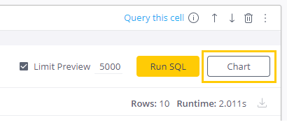
- In the query results, click Chart in the specific cell. The chart view appears.
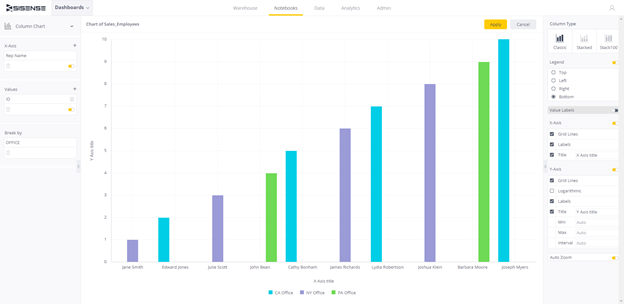
- Select the data and chart type you want to visualize.
Available chart types include:- Indicator
- Pie Chart
- Column Chart
- Bar Chart
- Line Chart
- Area Chart
- Table
- Configure the axes and series (Break By)
- Apply filters.
- To save the chart, click Create. The chart appears as a cell in your Notebook.
Manipulating Charts
Arranging Charts
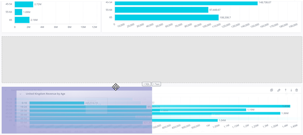
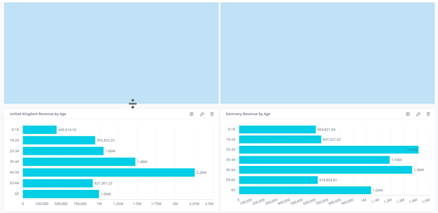
In Edit mode, drag and drop charts in your Notebook to arrange them side-by-side, or on a row of their own. In the following image, a chart is being dragged from its own row (gray) and positioned next to another chart (purple placeholder).
Only text and chart blocks can be dragged to be rearranged or resized. SQL and Code blocks cannot be dragged to rearrange or resize them. Use the up and down arrows to reorder the code blocks.

Resizing Charts
In Edit mode, resize the chart's height and width by dragging the chart border. When resizing, the chart turns blue.
Coloring Bar Charts
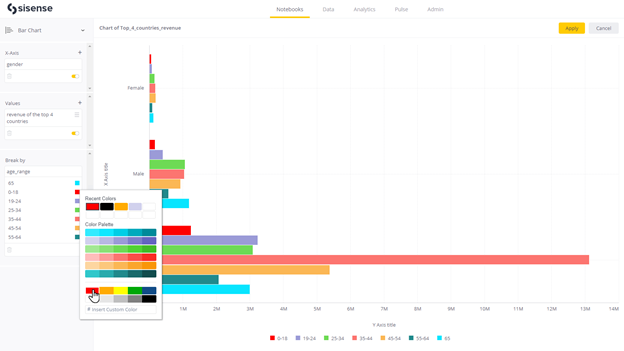
If you create a bar chart, you can apply colors to it.
- If you do not already have a bar chart in your Notebook, create one.
- Above the bar chart, click (FIGURE) to edit it.
- Add a "break by".
- Click a color next to a value to open the color palette to select a new color or enter a custom color value.
- Click Apply.
Filtering Charts
Filters are added to charts from the Notebook editor by data designers. All other users with view access to the notebook can interact with the filters from the view-only mode
Filtering options include:
Filters only apply to Chart blocks and not the Preview tables that are shown in the SQL and Code blocks. If there are no charts on the Notebooks, the filters do not apply to anything. The filters that can be added are automatically populated and shown in a drop-down to the users based on the columns that are outputted from the SQL the user has written and run. After choosing the filter based on the columns, the values are auto-populated based on everything that is available in that column. In view-mode, users do not see the Filter panel if the Notebook editor has not added any filters to the notebook.
Some features found in the Dashboard filtering, such as customizing queries with JSON or code, selecting single-select mode, and saving a filter as starred are not supported in Notebooks.
Setting Date Filters
There are various options for setting a date filter for your dashboards. Click on each of the options below to learn how to set date filters.
Use this filter to select a single or multiple specific periods from a closed list. For example: "Year = 2020", "Month = February 2021", "Quarter = Q3 2019 + Q4 2019", etc.
.png)
To set a filter by including specific time periods:
- Select the period granularity (Year, Month, etc.), and then select the specific periods from the list (e.g.
January 2021, Q4 2020, etc.):
- If Allow multiselect for lists is enabled, you can select all options in the second list or clear all selections. Otherwise, select a single option.
- Dates are listed chronological and descending. After selection, the selected options move to the top of the list
- Dates available for selection are dates that belong to the dataset. The list is updated dynamically to include new dates added to the dataset
- Weeks are based on the system's "First day of the week" Admin setting. For example, if first day of the week is set to "Monday", then selecting "This week" from the filter will return all data from Monday of the current week (e.g. week 32) till today
- If the Admin setting for Fiscal year is turned on, then Fiscal year is supported and relevant periods in
the list display the fiscal year tag (Years, Quarters, Weeks):
.png)
- Results are retrieved based on the fiscal year: for example, if my fiscal year starts in April, and I select "Q1 2020", then it should retrieve results from April 1 2020 - June 30 2020.
- You cannot exclude any dates in this filter type. Use the Is not option for this. See Setting a Filter to Exclude exact time periods.
Use this filter to select ANY possible number of defined time periods to get data and answers to any timeframe that's relevant for your needs. For example, I want to be able to select "Last 13 months", "Last 5 days", "Next 3 months" or any other combination. The time period can be in the past, or in the future.
Add to this filter the option to include the current period, if required. For example: "Past 7 days including/excluding TODAY", "Past 2 weeks including/excluding THIS WEEK".)
- In the Filter window, select the third radio button, and from the dropdown list, make your selection as
required.
.png)
- Select the amount and time period you want to include. If you select This, then you can only select the time
period.
.png)
- Select Including current to include the current period:
- This includes the current period (This week/month etc.)
- Default setting is OFF
You can filter by 3 types of date ranges:
- If you have specific start and end dates (for example: "Show all flights between March 13 2020 to March 17 2020") ? selecting a start date and an end date from the calendar
- If you know the start date, but do not want to limit the end date (for example, "Show all contracts signed as of Jan 1st 2020") ? select a start ("From") date from the calendar, and select the "Latest date" option as the end date.
- When you know the end date, but do not want to limit the start date (for example, "Show all contracts that
were signed anytime up to Dec 31 2020") ? select the "Earliest date" option as the start date
("From"), and select the desired end date from the calendar.
.png)
- Use the Today option as a shortcut to set Today's date. However, note that Today is not a dynamic setting (it enters today's date, but then that date remains selected, and does not change as days go by.
- Dates available for selection are dates that belong to the dataset. The list is updated dynamically to include new dates added to the dataset. Dates for which there is no available data appear grayed out.
Use this filter to exclude a single or multiple specific period/s. For example, "Show me all sales except
for December 2021".

- In the Filter window, select the fifth radio button, select the condition Is Not and then select the period/s from the dropdown lists.
Use this filter to set a date filter that is dependent on a value of a certain measure, to ask questions such as
"Show the Top/Bottom 10 months in terms of Total Cost".
.png)
- On the fifth radio button in the filter window, select the condition (Top or Bottom).
- Select the number and type of time periods (e.g. 10 months).
- In the Ranked by field, select the measure to be used for ranking (e.g. Total Sales, Number of students, etc.).
Use this filter to set a time frame that is relative to a date that may not be Today, but rather
some other date, or a moving date, such as our latest date, to ask questions such as "show
all sales for the last 3 days in which we had sales".
.png)
- In the Filter window, select the fifth radio button and select the condition Is Within.
- Select the time frame; period, before/after, date.
- If you do not want to limit the start date or the end date, select Earliest date or Latest date from the calendar.
Use this filter to select an hour or part of an hour, not on any specific date, to answer questions such as
"How many calls do we get between 2-3 am?" or "How many customers do we have during the morning
hours vs. afternoon hours?".
.png)
Setting Text Filters
Text filters let you filter according to text matching. Text filters are case insensitive for all data sources by default.
There are various options for setting a text filter for your dashboards. Click on each of the options below to learn how to set text filters.
Use this filter to select a specific known value or multiple values to view, for example, "Condition = New +
Refurbished".
.png)
- Searching for a value:
- If Allow multiselect for lists is enabled, you can select all options in the second list or clear all selections. Otherwise, select a single option.
- When the list is filtered by search, Select all applies to the filtered list - only items that appear will be selected.
- Search is not case-sensitive.
- You cannot exclude any values from this list. Use the Is not option for this.
Use this filter to find values by certain textual characteristics. For example, "All products starting with
''iphone", ''All products containing "chair".
.png)
Use this to filter a textual field, depending on the value of a certain measure, to answer questions such as "Show the Top/Bottom 10 countries in terms of Total sales".
- On the third radio button in the filter window, select the condition (Top or Bottom).
- Select the number of items you want to retrieve from the textual field (e.g. 10 countries).
- In the Ranked by field, select the measure that will be used for ranking (e.g. Total sales).
Setting Numeric Filters
Numeric filters let you to limit your dashboards to specific value ranges. For example:
- Keep only sales above 100$.
- Keep only product IDs between 1000020 and 1000030.
There are various options for setting a numeric filter for your dashboards. Click on each of the options below to learn how to set numeric filters.
Use this filter to select a specific known value or multiple values from a numeric field: for example:
"Quantity = 1 and 2 and 3".
.png)
- Searching for a value - you can search the list of numeric values to narrow it down. When the list is filtered by search, Select all applies only to the items that appear in the filtered list (items that match the search criteria).
- You cannot exclude any values from this list. Use the Is not option for this. See Set a filter to exclude specific value/s.
You can filter numeric values by a range ("between"), for example, "All products whose price is between 1.99
and 20".
.png)
You can filter numeric values by specific characteristics. For example: "All customers whose age is over
15", "All products whose price is between 1.99 and 20".
.png)
Use this to filter a numeric field, depending on the value of a certain measure, to answer questions such as "what were the Top/Bottom 10 versions in terms of Total number of bugs".
- On the fourth radio button in the filter window, select the condition (Top or Bottom)
- Select the number of items you want to retrieve from the numeric field (e.g., 10 ID numbers)
- In the Ranked by field, select the measure that will be used for ranking (e.g., Total number of bugs )
Use this filter to exclude a single or multiple value/s, for example, "Show me all IDs that are not 3144 and 3145".
- In the Filter window, on the fourth radio button, select Is Not and then select the values/s you wish to exclude from the dropdown list.
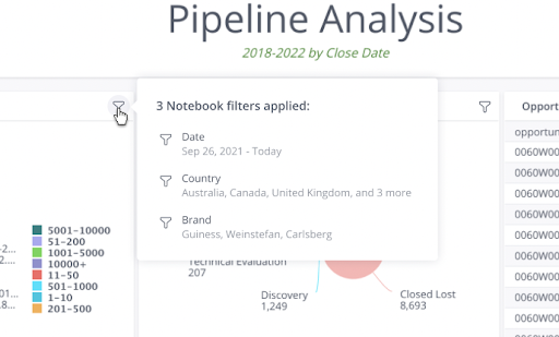
After filters are applied to a chart, you can hover over the filter icon on the chart block to see which filters are applied.
