Tabber
Last updated: June 11, 2026
| Tier | Deployment |
|
|
Tabber is a Sisense certified add-on. This means that it comes installed together with Sisense and you do not need to perform any separate download or installation. However, it is disabled by default, and you must enable it (instructions are below) in order to use it.
Overview
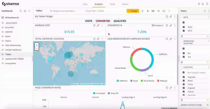
Tabber is a widget that enables you to create tabs for your dashboard so that you can organize the dashboard's widgets into the tabs. The following image shows three tabs, each containing two indicator widgets. Note how different indicator widgets are displayed when the different tabs are selected.
Enabling Tabber
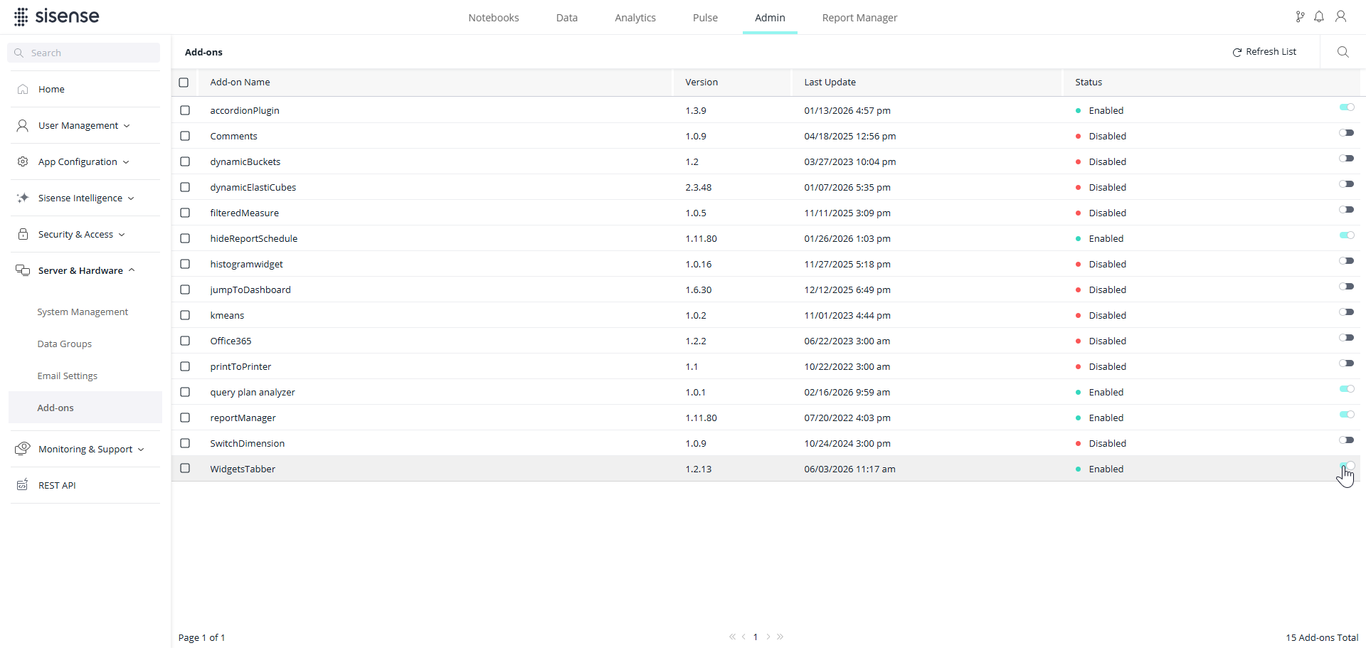
Only administrators can enable Tabber. To enable Tabber:
-
Select the Admin tab.
-
Select Server & Hardware > Add-ons.
-
In the WidgetsTabber row, toggle the switch on.
Creating a Tabber Widget
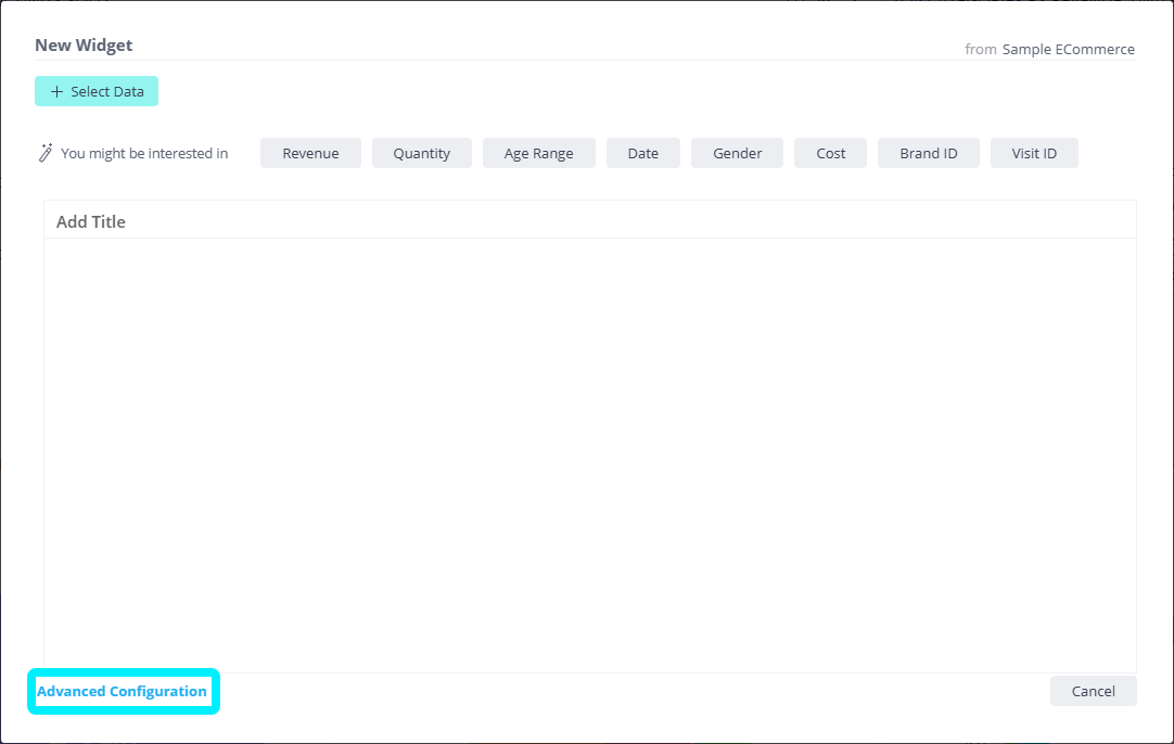
-
In the Analytics tab, click
 to create a new widget.
 -
In the New Widget window, click Advanced Configuration.
-
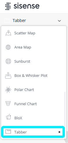
Scroll through the widget types on the left and select Tabber (note that Tabber will only appear if it is has been enabled by an Admin).
-
Click Apply. The Tabber widget is added to the bottom of the dashboard.

-
In the Tabber widget, click
 to go back to Edit mode to edit the widget.
Creating/Editing the Tabber Widget via the UI
You can create and edit the Tabber widget via the widget editor. You can see that by default there are two Tabber tabs. The design of the widget is configured via the Tab settings and Design panels on the right side of the Edit mode window.
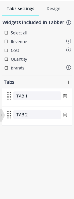
Tabs
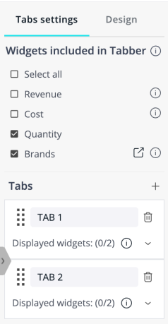
In the Tabs settings panel, first select the widgets to be included in the Tabber; included widgets will be displayed or hidden as defined by the Tabs settings, while the rest will not be affected by this Tabber. The “Widgets included in Tabber” list contains all widgets (other than Tabber widgets) that are present in the current dashboard.
Note:
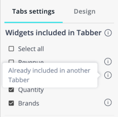
If you set up multiple Tabber widgets in the same dashboard, widgets that have already been included in other Tabbers will have an  icon next to them. On a dashboard, a widget included in multiple Tabbers will be shown or hidden as defined by the last tab selected by a user. It is usually best to only include a widget in one Tabber to avoid confusion.
You can change the title text of each tab (in the text field), change their order (click and drag  ), add tabs (
  ), and delete tabs (
  ):
):
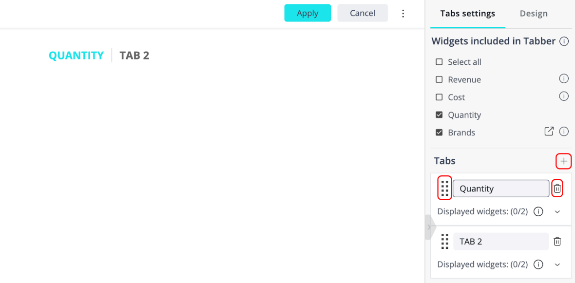
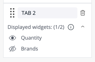
Beneath each tab name is an expandable list of included widgets, named "Displayed widgets". All widgets are hidden by default, as indicated by the  icon. Next to each widget name, to ensure that you know what that widget displays, you can click
 to view that widget in a new tab.
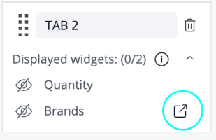
Click the icon, changing it to  , for any widgets that you want to display.
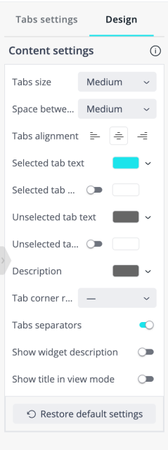
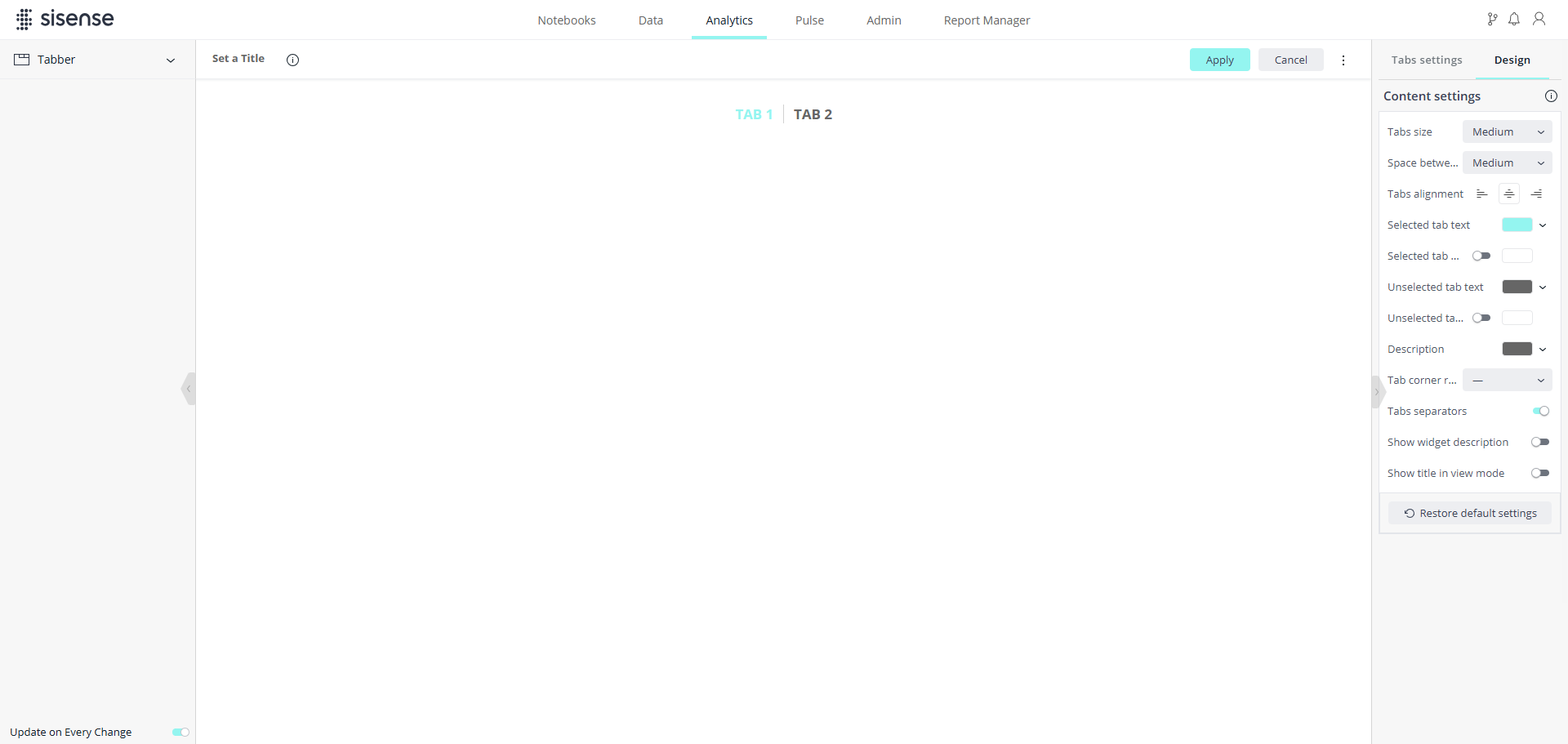
Content Settings
In the Content settings section of the Design panel, you can configure how the contents of the tabs are displayed. These settings include sizing, spacing, colors, and more. Each design option is self-explanatory, and you can see some of their effects in the image below.
Creating/Editing the Tabber Widget via Scripts
Scripts are the original method used for creating and editing the Tabber widget. A newer method, via the UI, has since been added and is the preferred method. To create/edit the Tabber widget via the UI, see Creating/Editing the Tabber Widget via the UI above. Starting from Tabber version 1.2.0 (the version included starting with Sisense version L2024.2), the configuration parameters supported in the UI will be ignored in the script. However, the widget script functionality will remain available (as with all other widgets) and the script code other than the Tabber configuration will be executed.
If you encounter any issues with the widget display after updating to Tabber version 1.2.0 (the version included starting with Sisense version L2024.2) or newer, you can revert to configuring the widget using the script by adding the following parameter: widget.scriptConfig = true;
To return to using the UI configuration, change the property to false.
To create/edit the Tabber widget via a script:
-
Select
 > Edit Script.
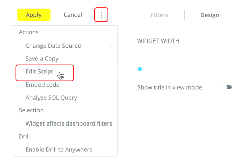
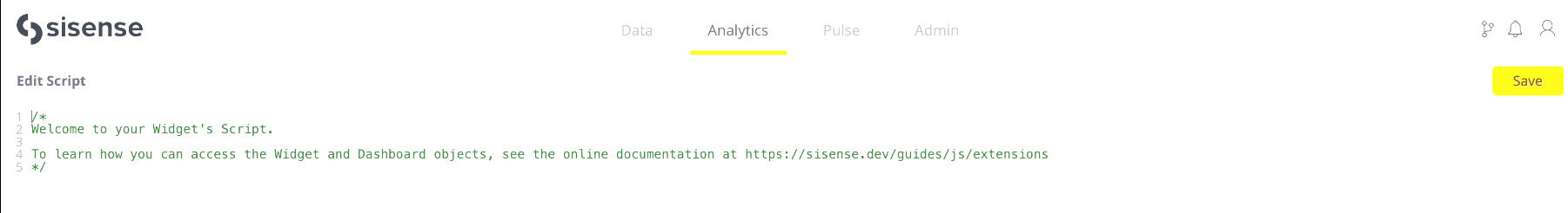
The Edit Script window opens.
-
In the Edit Script window, enter a script that will define the Tabber widget's appearance and functionality.
For example, the following is the script for the Tabber widget shown in the first image above: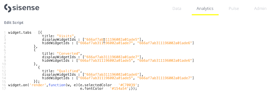
In the sample script above, the following is defined for each tab:
-
title - The title text of the tab
-
displayWidgetIds / hideWidgetIds - Which widgets from the dashboard are shown/hidden when the tab is selected
-
selectedColor / fontColor - The color of the selected / not selected tab
-
-
Click Save > Apply to create/update the widget.
Notes about Viewing and Using the Tabber Widget
-
When you are done configuring the settings above, click Apply to save and apply your changes.
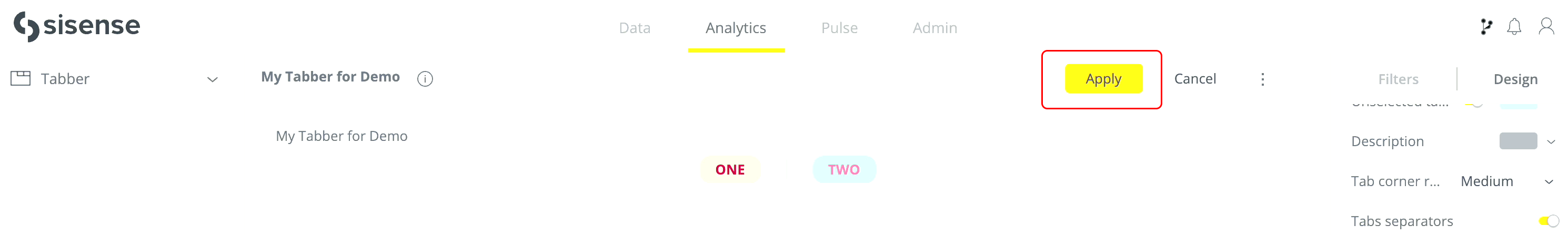
After clicking Apply, your dashboard will be displayed, including your Tabber widget.
-
The newly created widget may appear small at first. Its size is defined in the same way as all other widgets and it can be enlarged by dragging the border.

-
If you selected Show title in view mode (at the bottom of the Content settings), the designer will see the widget title in View mode (in addition to seeing it in Edit mode), and the viewers will see the title as well.

-
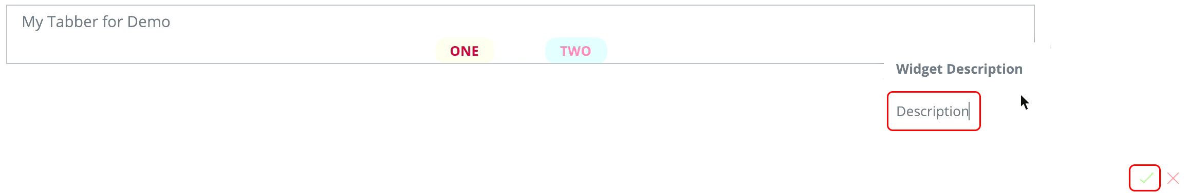
To add a description of the widget, click
 > Add Description, type the description, and click
 .
.
If you selected Show widget description (at the bottom of the Content settings), upon refreshing the page or entering Edit mode the description will be displayed in the widget.

-
If you have multiple Tabber widgets in one dashboard, only one tab is displayed at a time, from whichever Tabber widget is selected last.
-
The option "Width" was removed from Tabber version 1.2.0 (Sisense version L2024.2). If you use it and have a corrupted view after updating, add the following line to the widget script:
widget.style.width = 0;This will enable the widget to align in the widget container according to the alignment setting in the design panel.
Tip:
For more information, see Resolving resize widget Issue when the Tabber Widget is in use on the Sisense Community site.