Explanations: Identify Reasons for Changes in Your Data
When you see a spike or sudden decrease in your data, or you want to find the root causes that contributed to that behavior, to help you react accordingly and plan ahead. Manually seeking the key drivers is time consuming and ineffective. You would need to drill down into different fields (a.k.a. "dimensions"), or meet with people in your organization to find the reasons for the behavior in your data. You would also have to come up with hypotheses for the explanations you want to investigate further. Aside from the time this takes, this method is error-prone and there may be things that you have not thought about.
The Explanations feature automatically identifies the most probable key drivers for a given change in your data. It covers hundreds of possible contributing factors and presents the top ten fields (or combinations of fields) that contributed most significantly to the change in behavior between the selected point and a previous point. You can explore these fields to see what effect they had on your data. This helps you get the answers you need inside Sisense and enables decision makers to easily understand connections and root causes in their KPIs.
To find the root causes or possible contributing factors to a KPI (Measure), Explanations analyzes a larger data set that is enriched with additional fields from the data model/dashboard. They are retrieved from our knowledge graph and are based on both prior analyses/queries performed on the system as well as enrichment of other fields from the model.
For a short demonstration of Explanations for time, see the video below:
How it Works
Fields that Appear as Possible Explanations
Explanations analyzes all possible factors (fields or combinations of fields) that have influenced the change in a selected point in a data set (time, location, etc.), compared to a different point (for time based widgets) or that contribute to a KPI (for indicator widgets). Explanations then displays the most probable explaining fields, ranked by their contribution.
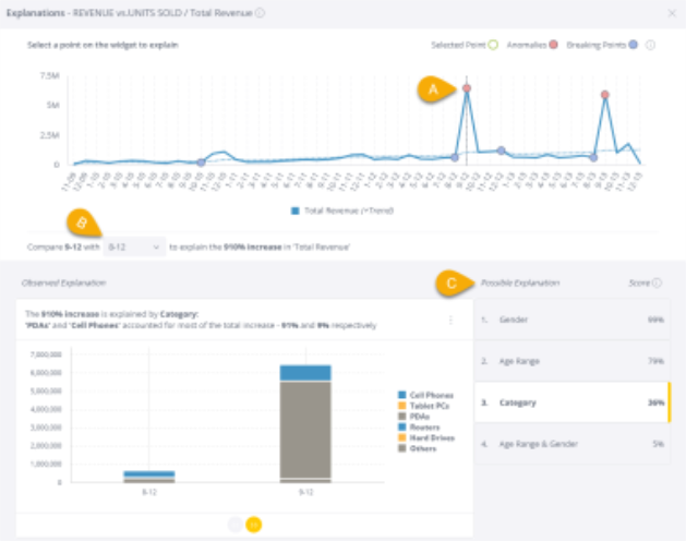
As indicated in the example, below, using textual descriptions (A) and automatically generated visualizations (B), Explanations tells you which field(s) drove the behavior (C), and within each field, how much each member contributed (B). Sometimes, Explanations identifies several possible contributing factors that could explain an anomaly in your data. Since you know your data and your business best, Explanations displays these multiple possibilities, ranked by their calculated contribution. You can then evaluate them and make decisions based on the one that makes the most sense in the context of your business. For example, in the image below, Explanations identified "Category", "Age Range", "Condition", "Gender" and also the combination "Age Range & Condition" as possible explanations for the 810% increase in revenue.
For Explanations for time, Sisense provides either one or two visualizations (depending if there are members with significant changes within the data points) that enable you to investigate the data from different perspectives: "View by Value Distribution" and "View by % Change". For Explanations for indicators, there is only one visualization: "View by Value Distribution". For more information about these visualizations, see Using-Explanations below.
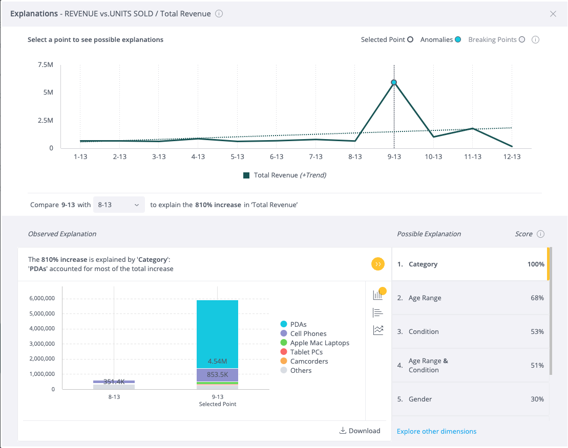
You can understand the Explanation "Category" in this example, as follows:
-
The business owner is attempting to understand the causes for a sudden increase in the business's total revenue. Explanations found that in relatively high probability, the identity of the Categories that the business sold that month (Cell Phones, PDAs, Tablets, etc.) had an effect on the revenue increase.
-
Explanations found that the sales for PDAs (a member within the Category field) accounted for most of the total increase in Revenue.
-
The score for the Explanation "Category" shows that it is the strongest Explanation (Contributed the most to the change in Total Revenue between August and September 2013). Other fields such as Age Range and Gender also contributed to the change but with a lower score.
Looking for Explanations Outside the Dashboard
Explanations leverages Sisense's Knowledge Graph to identify relevant fields and to pull them into the analysis, even if they aren't included in the dashboard. This ensures that your Viewers do not miss possible explaining fields. It also allows you to keep your dashboards succinct, fast, and focused, not needing to add unnecessary information to them.
Setting Up Explanations
Enabling / Disabling Explanations
Explanations is enabled by default.
Important:
- Enabling / Disabling Explanations will make it available / unavailable on all applicable widgets in all dashboards. Explanations cannot be enabled / disabled for individual widgets.
- Explanations may include all fields from across all dashboards in the data model. You can change this and limit Explanations to include only fields that appear in the specific dashboard. For more information, see Changing Explanations Settings.
To enable / disable Explanations in your system:
-
From the Admin tab, search for and select Feature Management, which is located under App Configuration.
-
In the AI section, toggle on / off Explanations.
_639x344.png)
-
Click Save.
Changing Explanations Settings
As a Dashboard Designer, you can change the way Explanations works for Viewers by deciding which fields will be included in the Explanations results. By default, Explanations can include any fields from across all dashboards created over the same data model. This enables viewers to leverage Sisense's Knowledge Graph to uncover relevant explaining factors, even if they weren't included in the dashboard in advance. You can change this and limit Explanations to include only fields that appear in the specific dashboard.
In both settings, Date Security is respected. Viewers will only see Explanations that are based on fields that they are authorized to see.
-
From your dashboard, click
 and select Dashboard Settings.
 -
In the Explanations section, select the required option from the drop-down menu.
Note:
By default, All fields within the data model is selected.
-
Click Apply.
Working with Explanations
Generating Explanations from a Widget
There are two methods for generating Explanations for a given point:
- Directly from a point in a Time Series(this is only applicable to Explanations for time; this does not apply to Explanations for indicators)
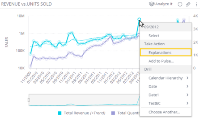
- In a time-series widget, right-click the point you would like Explanations for.
- Select Explanations.
- From the Widget Menu(applicable for time or indicators)
- In a widget, click Analyze It > Explanations.
- If there are multiple metrics in the widget, select the one for which you would like to generate an Explanation.
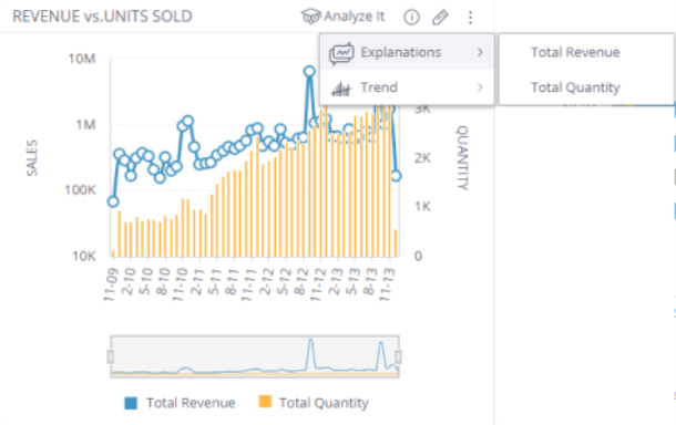
The Explanations screen shows the graph that you selected. For Explanations for time, Anomalies and Breaking Points are highlighted for you, to help you find interesting points worth exploring.
- For Explanations for time, on the graph, click the point for which you would like to generate an Explanation.
Using-Explanations
For Explanations for time:
- Select a point on the graph to investigate (A).
- (Optional) Change the comparison time period, if required (B). By default, Explanations compares the selected point to the previous point in time. However, you can be very flexible in the periods that you compare a data point to, as long as it is an earlier point in time than the selected data point. For example, you can compare the data point to a different period, such as the same month last quarter, or the same month last year. The available time periods are the ones that appear in the widget.
- Review the Possible Explanations (C). The Possible Explanations are given a score, calculated based on:
- The relative contribution of certain members (values) of that field to the change (increase or decrease)
- The growth rates of the largest contributors (the % change in their values between the two points).
For Explanations for indicators:
-
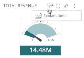
Click the owl icon at the top of the indicator and select Explanations.
-
Review the Possible Explanations. The Possible Explanations are given a score, calculated based on member distribution (a histogram). Members that have significant differences in values will be ranked higher than members with similar values.
Keep in mind that, depending on your data, the Possible Explanation with the highest score might not always be the most suitable. You'll usually know, based on context, which explanations make the most sense in your case.
For each Explanation, you will see either one or two visualizations. Explanations for indicators always only has the "View by Value Distribution" visualization. Explanations for time also always has that visualization, but if there are members with significant changes within the data points, there will also be the "View by % Change" visualization. If both visualizations are available, you can move between them by clicking the yellow button at the bottom: 
-
View by Value Distribution : This visualization helps you see the changes in the values of each member between the previous period and the selected data point. This helps you see which members accounted for most of the total change.
-
View by % Change : This visualization helps you see how much each member (value) has changed as a percentage, compared to its previous value.
Identifying Anomalies and Breaking Points
Most of the time, interesting points to explore are easy to see, such as a sudden increase or decrease in a given metric. However, sometimes the most significant changes aren't so obvious, especially in a noisy time series. This is why Explanations helps you by identifying anomalies and breaking points in your data.
- Anomalies - A data point that differs significantly from the rest of the points. An anomaly can indicate a problem with the data-gathering process, a mistake in the data, or a rare event that is worth investigating further.
- Breaking Point - A data point in which there was a change in the behavior (distribution) of the data, such as the beginning of an increase or a decrease.
Exploring Other Fields
Sisense shows the fields that have the highest Explanation scores. However, you might like to add other fields to see how they affect the Explanations. By doing this, you can bring your own domain knowledge into the equation, which might enhance the Explanations that Sisense provides.
-
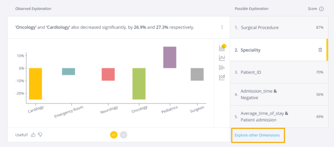
Under Possible Explanations, click Explore Other Fields.
-
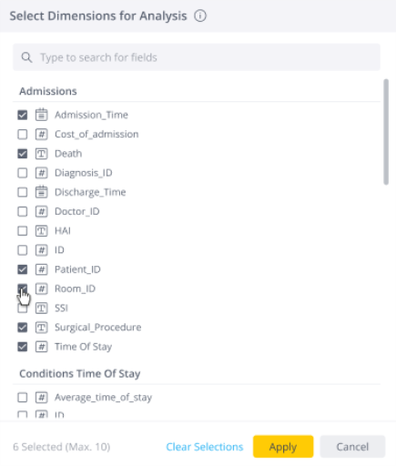
In the following screen, select the fields to consider as contributing factors to the Explanations. You can select any field that has been used with this measure in the current dashboard, or across all dashboards on this data source (depending on the dashboard setting, as set by the data designer).
-
Click Apply and the fields you selected are added to the Possible Explanations.
Downloading and Sharing Explanations
When you have found an Explanation worth sharing for the data point you are investigating, you can download it as a .png file.
-
In the Observed Explanation section, click
 .
. -
Click Download Image.
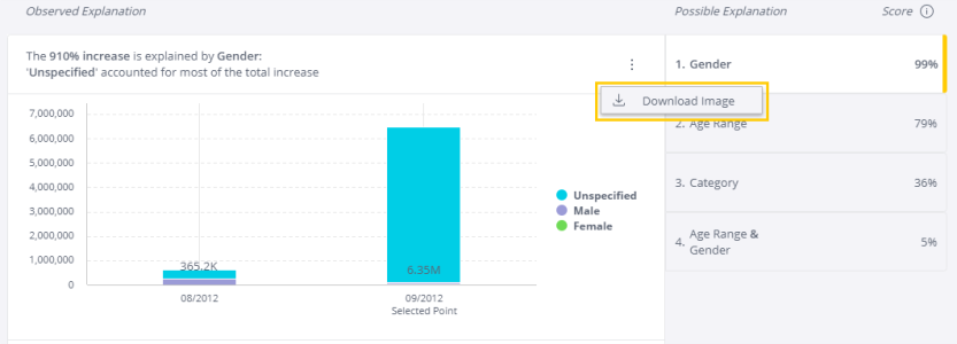
An image of the Explanations screen, including the time-series and the Observed Explanations, is downloaded as a .png file to your computer which you can then share with others.
Security and Privacy
Sisense Explanations does not require cloud access.
Note:
In versions prior to L2023.3, data was sent to the cloud service. Starting with L2023.3, Explanations no longer requires cloud access.
Explanations respects your security and privacy. Data is not sent to the cloud and is not saved in the logs.
Sisense has row-level security and Viewers will only see the members of fields that they're authorized to see. You can decide if Viewers can see Explanations based on all fields within the Data Model (this is the default), or only based on fields in the current dashboard. For more information, see Changing Explanations Settings.
Limitations
Supported Measures
- Explanations only works on measures that are based on the aggregate functions SUM and COUNT ALL (DUPCOUNT).
- Measures based on other formulas, such as: AVERAGE, MEDIAN, COUNT, Quotients (results of a division of two numbers), are not supported. This is because for each field considered as a possible explanation, breakby is applied, and later the calculated measure is aggregated with sum. If the calculated measure is SUM/COUNT, the aggregation applied is consistent and retains the same meaning. If the calculated measure is AVERAGE, the aggregation applied will break the measure meaning, which will no longer represent the average.
General Limitations
- Explanations only works on Indicator charts and Cartesian charts, such as column, line, area, and bar charts.
- Explanations supports time series with a single date field, or indicator widgets.
- Only certain measures are supported. For more information, see Supported Measures.
- Explanations does not work properly when the measure is filtered by a dependent filter.
- Explanations can only run on a widget when the relevant table is limited to:
- Explanations for time - 55k rows (cannot run if the data set is larger than 55k rows).
- Explanations for indicators - 200k rows (cannot run if the data set is larger than 200k rows).
This limitation may be solved by applying a widget or dashboard filter to reduce the amount of data in the widget.