# Creating Interactive Dashboards
> Create Interactive Dashboards. While you can continue using Sisense's default widgets in your BloX dashboard, the real value of BloX is turning your dashboard into an interactive business app.
*Source: https://docs.sisense.com/main/SisenseLinux/creating-interactive-dashboards.htm*
---
Last updated: June 10, 2026
| | | |
| --- | --- | --- |
| [Tier](https://www.sisense.com/pricing/#pricing) | [Deployment](https://docs.sisense.com/main/SisenseLinux/introduction-to-sisense-cloud-managed-services.md#ComparisonofManagedCloudandSelfHosted) | [Availability](https://docs.sisense.com/main/SisenseLinux/l2026-2-release-notes.md#ClassicMode) |
| Enterprise | Cloud On-Prem | Classic Mode Only |
While you can continue using Sisense's default widgets in your BloX dashboard, the real value of BloX is turning your
dashboard into an interactive business app.
The typical work flow for creating BloX widgets is to take a pre-made template, and then modify it by adding content,
snippets, and actions. After you have finished modifying the template, you can save it and start creating new widgets
from it.
The sections below explain how you can use BloX to transform your dashboard.
- **BloX Widgets** - Describes how to build BloX widgets
- **Templates** - Describes how to modify and create templates
- **Adding Content to Widgets** - Describes how to add content to your widgets using snippets and
actions.
If you haven't already, you may want to review the [BloX Tutorials](https://docs.sisense.com/main/SisenseLinux/sisense-blox-tutorials.md) for more information.
[**BloX Widgets**](#)
Interactive dashboards in Sisense consist of BloX widgets. In the Editor, you define the content
of your BloX widgets.
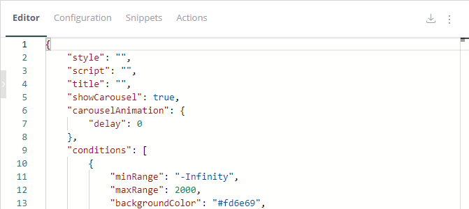
BloX widgets are built on schemas that have the following basic structure:
- **Body** - The body of your BloX is made up of building-blocks known as elements. Elements can be
composed in a variety of arrangements to create many types of BloX.
- **Actions** - Many BloX have a set of actions that you can take. This property describes the
actions that typically get rendered in an "action button" at the bottom of your widget.
The example below illustrates the JSON structure common to all BloX:
```
{
"style": "",
"script": "",
"title": "",
"body": [
{
"type": "TextBlock",
"text": "This is my Sisense InfoCard"
},
{
"type": "Image",
"Url": "https://cdn.sisense.com/dotcom/images/sisense-logo.png"
}
]
}
```
At the top are two keys, style and script, for adding your own JavaScript and CSS if you want to use custom
classes in your BloX widgets.
Below is the body element that behaves just as a body element does in a typical web page. Within the body
element, each element has a **type** property that determines what type of object it is. In the
example above, there are two elements; a TextBlock and an Image:
- **TextBlock** - Adds a block of text with properties to control what the text looks like.
- **Image** - Adds an image with properties to control what the image looks like.
As in web pages, in BloX widgets, every element stacks vertically and expands to the width of its parent. You can
use snippets like containers, columns, and column sets to add multiple elements side-by-side. Containers act as
HTML divs where you can define a collection of elements. Column Sets contain columns. Within a Column Set, each
column can be placed next to another column to allow you to add multiple elements on the same row instead of
stacking them one on top of the other.
Other elements you may use are Input and Action elements for collecting and submitting data. These elements and
more are described in the [BloX Reference](https://docs.sisense.com/main/SisenseLinux/sisense-blox-reference.md) page.
You can build a widget based on this structure, but each template pre-defined by Sisense already uses this
structure, so Sisense recommends using these templates and modifying them for your use case.
[Templates](#)
In the right corner of the BloX Design Panel, under the Design tab you can see your templates.
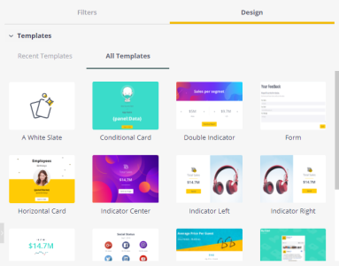
Templates are created by Sisense, but you can modify these to create your own templates. Templates are pre-built
widgets with content and actions.
The easiest way to work with BloX widgets is to modify templates that are the closest to your use case. After
selecting a template, the Layout, Editor, and Configuration Editor are updated with the content of your template.
In the Editor, you can add the content that is displayed in your widget. You can create this yourself as described
in the [BloX Widgets](#blox-widgets) section, however, it is much easier to use snippets and
actions to modify them as describe in [Creating Interactive Dashboards](#).
The procedures below describe how to save your templates after editing them and import and export them.
## Saving Templates
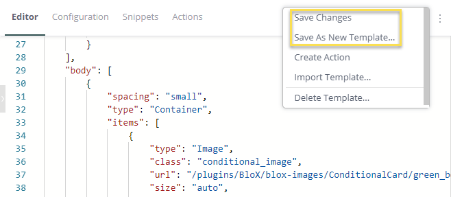
From the menu in the right corner of the editor you have two options for saving templates:
**Save Changes** - Saves your changes to the current template you are working on.
**Save As New Template** - Saves your changes in a new template. If you select this option you are
prompted to enter a name for the template. The template is then added to your list of templates above.
## Exporting Templates
You can export your templates and import them later or share them with other Sisense users so they can add them
to their dashboards. Templates are exported as JSON files that include the content under the Editor and
Configuration tabs (HTML and CSS).
**To export a template,**
- In the BloX Design Panel, click the download icon and select **Export Template**.
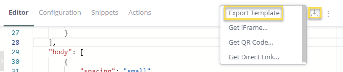
You are them prompted to download the JSON file that represents your template.
## Importing Templates
You can import templates (JSON files) that you have exported or that you downloaded.
**To import a template:**
1. In the BloX Design Panel, click the menu and select **Import Template**.
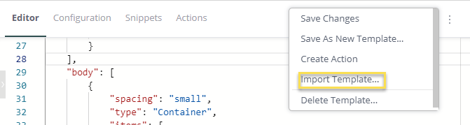
2. Navigate to your exported template JSON file and select it.
3. Click **OK** to upload it. The template is uploaded and added to your list of templates.
## Deleting Templates
If you no longer need a template, you can delete it. Before deleting a template, you may want to export it in
case you need to use it in the future.
**To delete a template:**
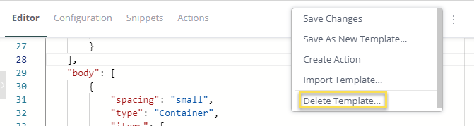
- In the BloX Design Panel, click the menu and select **Delete Template**. The template is removed
and no longer visible in the BloX Design Panel.
[Adding Content to Widgets](#)
Sisense makes it easy to add content to your widgets by providing code snippets for the supported
elements described above. With snippets you can build a complete widget or edit an existing BloX template by
inserting the relevant elements.
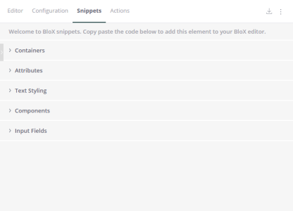
If you want to create a new BloX widget from scratch, you can begin with the BloX Main snippet, and then add
additional snippets to it. This snippet contains the mandatory keys for any BloX widget.
```
`{
"title": "BloX",
"showCarousel": true,
"backgroundImage": "",
"body":
[
{ "type": "Container",
"items":
[
{
"type": "TextBlock",
"text": "This is my BloX Card"
}
]
}
]
}`
```
From this basic snippet, more snippets can be copied and pasted into the BloX Editor and then modified according
to your needs.
For example, the TextBlock snippet can be added to your template to add a text object. You can then modify the
snippet as required to fit the style of the rest of your BloX.
```
`{
"type": "TextBlock",
"text": "{panel:Date}",
"spacing": "medium",
"horizontalAlignment": "center",
"color": "default",
"size": "medium",
"weight": "light",
"lineColor": "#414241
}`
```
It's important to remember that snippets are JSON objects that while they can be added anywhere to your template,
they must not break the structure of the template. For example, if you add the text block snippet shown above to
an existing template, you need to add a comma to the previous object, as you would in any JSON file:
```
`{
"type": "TextBlock",
"size": "light",
"weight": "light",
"horizontalAlignment": "center",
"spacing": "medium",
"color": "default",
"text": "{panel:Google} views
},
{
"type": "TextBlock",
"text": "{panel:Date}",
"spacing": "medium",
"horizontalAlignment": "center",
"color": "default",
"size": "medium",
"weight": "light",
"linAdding Text`
```
Text blocks display text in your widget and give you a way to provide context to your users.
```
`{
"type": "TextBlock",
"text": "{panel:Date}"
}`
```
| Property | Type | Required | Description |
| --- | --- | --- | --- |
| type | "Action.OpenUrl" | Yes | Must be Action.OpenUrl. |
| text | string | No | Text to be displayed. You can use placeholders to display values dynamically from your data. For example, {panel:Date} refers to the value of the Date column. |
## Adding Actions
You can add actions to your widgets. Sisense supports a variety of actions such as applying filters to a
dashboard or submitting a form through a webhook. You can read more about supported actions [BloX Reference](https://docs.sisense.com/main/SisenseLinux/sisense-blox-reference.md).
You can create your own custom actions. Actions that you create consist of custom JavaScript you provide, see
[Creating Custom Actions](https://docs.sisense.com/main/SisenseLinux/creating-custom-actions.md) for more information. In addition, you can
leverage [Sisense's
JavaScript API](https://developers.sisense.com/display/API2/JavaScript+API+Reference) for adding more functionality to your dashboards.
Once you create an action, its added to your code snippets where Designers can add the action to their widgets.
**To create -your own actions:**
1. Open a BloX widget.
2. In the Editor, open the menu and select **Create Action**.
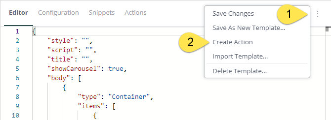
The Action Editor is displayed.
3. Enter a name for your action. This name is displayed when your action is added to the **My
Action** in the Snippets section.
4. Click **Next**. Sisense opens an Action template with two parameters, type and title.
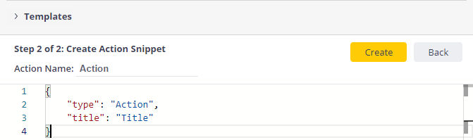
5. In the Action Editor, enter the code for your action.
6. Click **Create**. The new action is added to the My Actions section of your snippets.
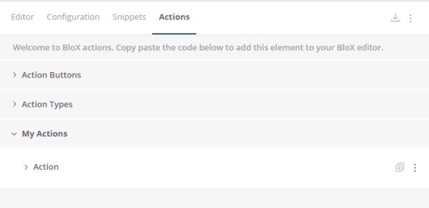
After the action has been added, you can open its menu to edit or delete the action.
## Adding Images
Images are useful for providing context or for branding your dashboard. Like Text blocks, images have their own
element, as shown in the snippet below.
```
`{
"type": "Image",
"url": "/plugins/BloX/blox-images/ConditionalCard/green_boto_bg.png",
"size": "auto"
}`
```
There are two options for hosting images, internally on the Sisense Server or externally. If you host the images
externally, the value of "url" is the full external address of the image.
When exporting your dashboard as a PDF or image, images hosted externally may not be displayed properly in your
report. You can host images locally on your Sisense Server in the `/plugins/` or `/branding/` directory located at */opt/sisense/storage/plugins* or */opt/sisense/storage/branding*. Images hosted here will be displayed properly in your dashboard and when exported to
your reports.
If you want to use an image as a background image, you can do so by defining the URL of backgroundImage:
"backgroundImage":
"https://s3.amazonaws.com/sisenseblox/Sample+-+SenseBUZZ+/Background+Imags/Header.png",
However, the background image will only cover up to the title area in your widget. If you want to display a
background image that covers the title area of your widget as well, set **display** to
"none".
```
`"titleStyle": [
{
"display": "none"
}
],`
```
| Property | Type | Required | Description |
| --- | --- | --- | --- |
| type | "Image" | Yes | Must be Image. |
| url | string | Yes | The URL to the image. To add your own images to BloX directly from the Sisense Server, you can upload them to */opt/sisense/storage/plugins* or */opt/sisense/storage/branding* and insert them in BloX by referring to the`/plugins/` or `/branding/` directory. "backgroundImage": "/plugins/sample.png" or "backgroundImage": "/branding/sample.png" |
| size | object | No | Controls the approximate size of the image. The physical dimensions will vary per host. Specify "auto" for true image dimension, or "stretch" to force it to fill the container. |
## Adding Sparklines
Sparklines allow you to add a tiny simple graph over a widget that conveys the basic shape of your data in a
meaningful, but compact way. Sparklines are useful for showing trends in your data.
You can add sparklines to any BloX widget by defining the values of the sparkline.
```
`{
"type": "TextBlock",
"text": "{spark:Data}
}`
```
| Property | Type | Required | Description |
| --- | --- | --- | --- |
| type | "TextBlock" | Yes | Must be TextBlock |
| title | string | Yes | Span with the class 'sparklines' that defines the dimensions and values of your sparkline. You can use a placeholder as the values of your sparkline, {spark:Data}, or enter each value hardcoded separated by a comma, 3, 15, 32, 75. |
## Embedding iFrames
You can embed iFrames into your widgets. This is useful for display websites, social media feeds, or streaming
videos. To display content in an iFrame, you add a Text block with the value of the text field the URL you want to
display in an iFrame element.
**Note:**
Each attributes included in the value of iframe src must be wrapped with single quotation marks 'x'. See the
example below for more information.
```
`"type": "TextBlock",
"text": ""`
```
| Property | Type | Required | Description |
| --- | --- | --- | --- |
| type | "TextBlock" | Yes | Must be TextBlock. |
| text | string | Yes | The URL of the iFrame you want to open. |
## Adding Carousels
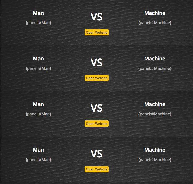
In many cases, there is more than one item in the result set. If you want to show them all, you can display them
as a list as shown below:
**Note:**
Due to performance concerns there is a limit of 100 list items.
Another option is to display your data in a carousel that your users can scroll through as shown in the example
below:
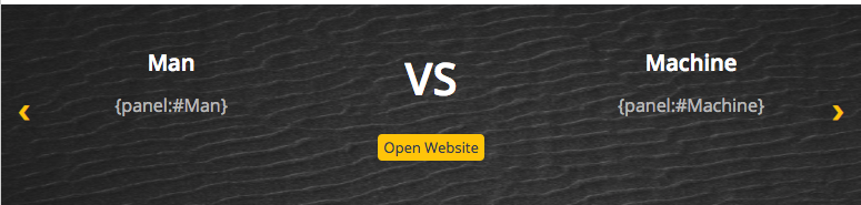
In the Card Editor, you can change the value of the Boolean key showCarousel to true, to display a single set of
items that users can toggle through or false to display a list.
```
`{
"title": "Multi Purpose Card",
"showCarousel": true,
"panels": [
{`
```
In addition, you can modify the amount of time it takes to cycle between values in your carousel with the
Carousel Animation object or whether or not to display arrows. The default speed is 500 milliseconds. You can
increase or decrease by adding the Carousel Animation snippet and changing the value of **delay** as
needed.
To hide the carousel arrows, set the Boolean **showButtons** to **false**.
```
`{
"title": "BloX",
"showCarousel": true,
"carouselAnimation": {
"delay": 500,
"showButtons": true
},
}`
```
## Using Conditionals
Conditionals allow you to create thresholds that trigger events in your widgets when met. In the example below,
the background color is set to gold when the placeholder {panel:Total Revenue} is greater than 1000.
```
`{
"title": "BloX",
"showCarousel": true,
"conditions": [
{
"minRange": "-Infinity",
"maxRange": 1000,
"backgroundColor": "#fd6e69",
"image": "https://image.ibb.co/d5vPpe/red_boto_bg.png"
},
{
"minRange": 1000,
"maxRange": 10000,
"backgroundColor": "#ffcb05",
"image": "https://image.ibb.co/dNuvvK/yellow_boto_bg.png"
},
{
"minRange": 10000,
"maxRange": "Infinity",
"backgroundColor": "#3adcca",
"image": "https://image.ibb.co/bY68FK/green_boto_bg.png"
}
],
],`
```
There are two steps to implementing conditionals. The first step is to add the condition\_data class to an object.
In the Conditional Formatting Target snippet, you can see several examples like the one below. In this example,
the condition\_data class has been added to a TextBlock. The condition is triggered by the value of
"text" in this case, a dynamic value taken from the dashboard panel.
```
`{
"type": "TextBlock",
"class": "condition_data",
"text": "{panel:Data}"
},`
```
The second step is to define what is the condition that must be met to trigger an action, and its results.
Sisense supports two types of conditions, numeric and strings.
## Numeric Conditions
Numeric conditions include a range of numbers. In the Conditional Range snippet, the min and max ranges are
defined and what happens when the value of the Conditional Formatting Target reaches a certain number. In the
example above, if Total Revenue ("text": "{panel:Total Revenue}") equals 1000 or less, then a
red background image is displayed.
There are two types of values you can enter, integers, such as 10, 20, 30 etc. or percentages, such as 20%, 30%,
40%, etc. For integers, simply add the value. If you choose to enter a percentage, add the value as a decimal, for
example, the value .2 represents 20% in your widget.
**Note:**
For the best results, your min and max range should be continuous. For example, for negative conditions, set
your minRange to "-Infinity" and your maxRange to 0. For neutral conditions, set minRange to 0 and
maxRange to 10, and for positive conditions, minRange 10 and maxRange "Infinity". You can set the
values as you like, but ideally, all the ranges of all conditions should create a continuous range with no gaps
and no overlaps.
## String Conditions
In addition, you can define strings that also trigger events. For example, in the Conditional Text snippet, you
can redefine how your widget appears when "textEquals" equals a string you define as shown in the sample below,
"Blox". The results of the action are then defined below in the same object. The important thing to remember is
that the value must be a string and placed within quotes " ".
```
`{
"conditions": [
{
"textEquals": "Blox",
"backgroundColor": "",
"hide": false,
"fontSize": "",
"fontWeight": "",
"color": "",
"image": ""
},
]
}`
```