Combining Two Types of Visualizations in a Widget
In chart widgets (such as Line Charts, Area Charts, Column Charts and Bar Charts), you can represent one or more selected field(s) using a different visualization than the visualization of the original widget.
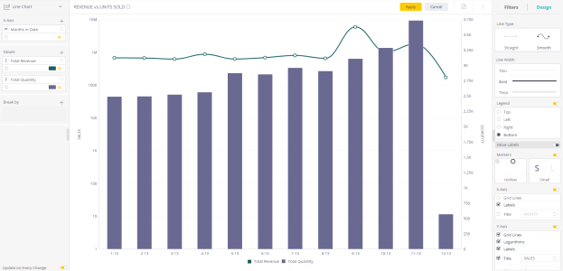
For example, the following example shows a Line Chart in which the Total Revenue is still represented as a Line Chart (the default), but the Total Quantity is represented as a Column Chart.
To select a different visualization for a field in the widget:
-
In the Widget Designer, in the Values area, add all the fields you want to represent (you need at least two fields in the Values area).
-
Right-click the field that you want to change.
-
Select Series Type from the menu. A menu of alternative visualization types is displayed.
-
Select the visualization to use for this field only.
-
Click Apply.
Tip:
If necessary, drag the field up or down in the Widget Designer to have a visualization brought to back or front.
Note:
The chart keeps the same visualization type as was originally created. The Design panel still displays only the design options of the widget's original visualization type.