Beginner's Guide to Sisense BloX with Actions
Last updated: June 10, 2026
| Tier | Deployment | Availability |
|
|
Classic Mode Only |
Sisense supports building custom interactive widgets for your dashboard using Sisense BloX. This section describes the components of a BloX widget, illustrating how to add interactive elements such as popups and dropdowns.
Prerequisites
Before proceeding, a working knowledge of the following is recommended:
-
JavaScript: for implementing custom actions and controlling widget logic
-
CSS: for defining styles and modifying widget appearance
-
HTML: for understanding the DOM structure and working with widget templates
Creating a BloX Template
-
From the dashboard, click
 > Advanced Configuration. The widget editor opens.
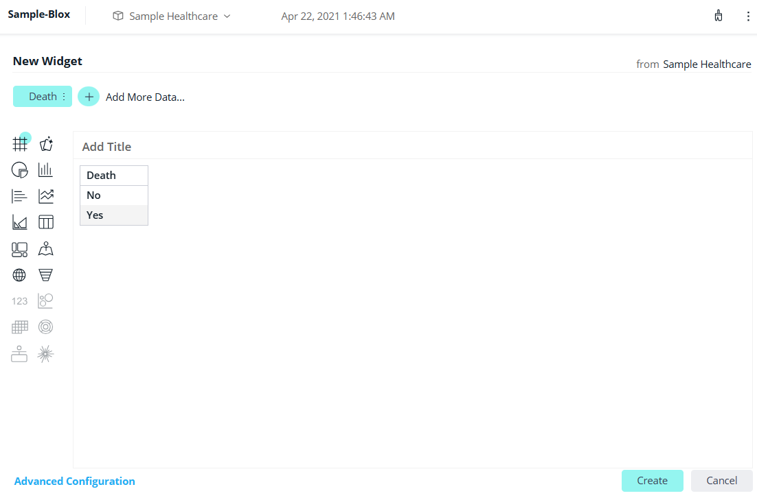
-
Change the widget type to BloX (top left-hand corner). The template editor opens and displays the JSON structure.
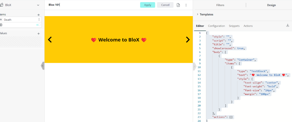
The Sisense BloX Template Editor contains the following key elements:
-
Editor: Used to write and modify the JSON structure that defines the layout and behavior of the widget.
-
Creating widget layout
(components) -
Adding styles
-
Referring to
actions -
Using data via
{{value}}syntax
-
-
Configuration: Create custom, reusable input fields (like drop-downs, text boxes) to customize a BloX widget without editing code. This includes:
-
Making BloX reusable with custom settings
-
Enabling users to change text, color, or fields without modifying the code
-
Dynamic customization
-
-
Snippets: A collection of pre-built mini templates or code blocks (e.g. JSON) that can be inserted into the Editor. They allow UI components to be built quickly while reducing syntax errors.
-
Actions: Define custom action handlers (JavaScript functions that can be called from the widget). They are used to create buttons and logic, call APIs, and apply filters. These include:
-
Alert popups
-
HTTP requests
-
Dynamic interaction logic
-
Accessing
$contextfor filters and metadata
-
BloX Widget Components
"style" (Optional) |
The “style” parameter defines the widget's overall CSS style. It can be used to change the look and feel of the widget including the background, border, and padding. |
"title" and "titleStyle" (Optional) |
The “title” and “titleStyle” parameters define the widget’s title and the title’s appearance. |
|
(for Custom Actions) |
The “script” parameter defines JavaScript functions for buttons that use a custom "action" name. It can be used to trigger a popup or execute a procedure based on user interaction such as clicking. |
"actions"
|
In BloX widgets that consist of multiple built-in procedures, the “actions” parameter is used to configure built-in Sisense actions (such as filtering and navigation). |
|
(Optional) |
The “data” parameter passes dynamic text from Sisense to BloX, including user name and KPIs. Note: The data must be offset with double curly braces: {{value}}. |
|
(REQUIRED) |
The “components” parameter defines what elements are visible in the widget (e.g. text, buttons, images).
|
Note:
BloX does not support comments in the main or configuration sections (JSON). Comments can be added within custom actions (JavaScript) using standard commenting syntax.
Debugging the Full BloX Editor Session
The BloX editor can be used to debug BloX code when configuring custom actions, data input mappings, or dynamic template conditions.
To debug BloX code:
-
Enable Chrome DevTools:
-
Open the BloX widget in the BloX editor.
-
Press F12 or right-click and select Inspect to launch Chrome DevTools.
-
Open the Console tab.
-
-
Insert debugging statements:
To inspect values or pause execution, add
console.log()ordebugger;statements in the following areas:-
My Actions: to track custom JavaScript behavior.
-
Data Input Mappings: to verify incoming values and context.
-
Dynamic Template Conditions: to log or break on logic that controls visibility or styling.
-
-
Preview and interact:
-
Use the Live Preview in the BloX editor (or test via a dashboard).
-
Interact with the widget to trigger your custom logic.
-
Monitor the Console tab for real-time logs or execution pauses if
debugger;is used.
-
Additional Resources
For deeper insights and examples, refer to the Mastering Custom Actions in Sisense.
BloX Code Examples
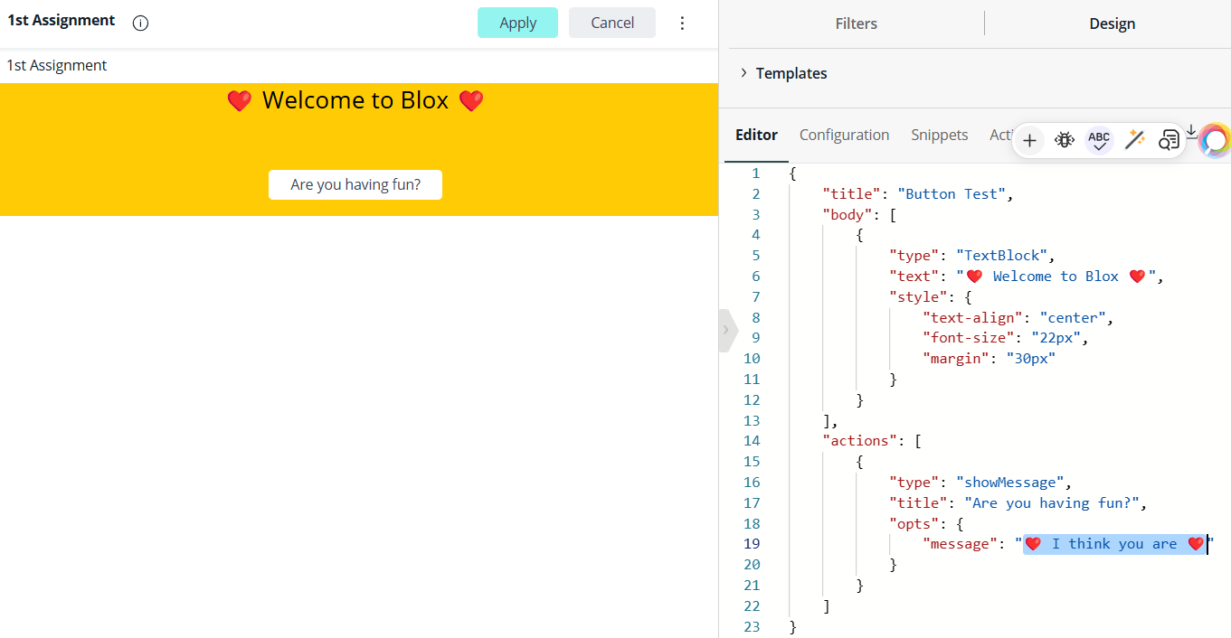
Alert Button: Display Popup Message
To create a button that triggers a popup alert:
-
In the Editor section of BloX, enter the following code.
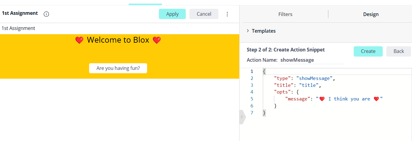
{
   "title": "Button Test",
   "body": [
       {
           "type": "TextBlock",
           "text": "❤️ Welcome to Blox ❤️",
           "style": {
               "text-align": "center",
               "font-size": "22px",
               "margin": "30px"
           }
       }
   ],
   "actions": [
       {
           "type": "showMessage",
           "title": "Click me!",
           "opts": {
               "message": "❤️ I think you are ❤️"
           }
       }
   ]
}
-
From the Actions tab, click
 > Edit Action.
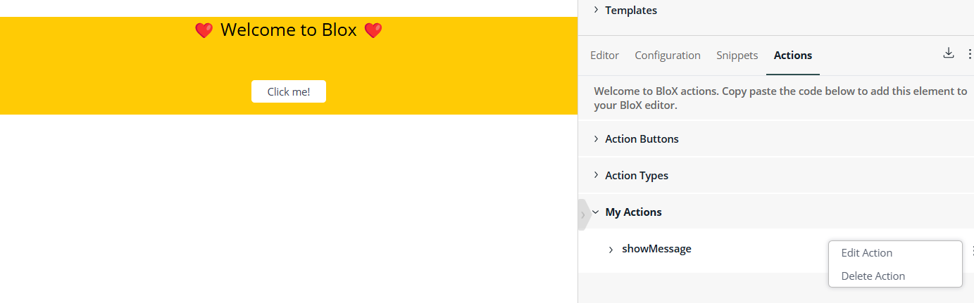
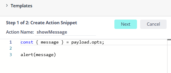
-
Update the action snippet as follows:
Copyconst { message } = payload.opts;
alert(message) -
Click Next.
-
Click Create.
-
In the BloX widget, click Apply.
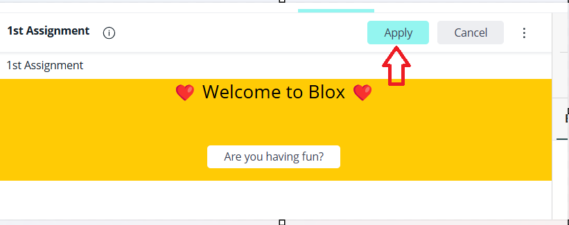
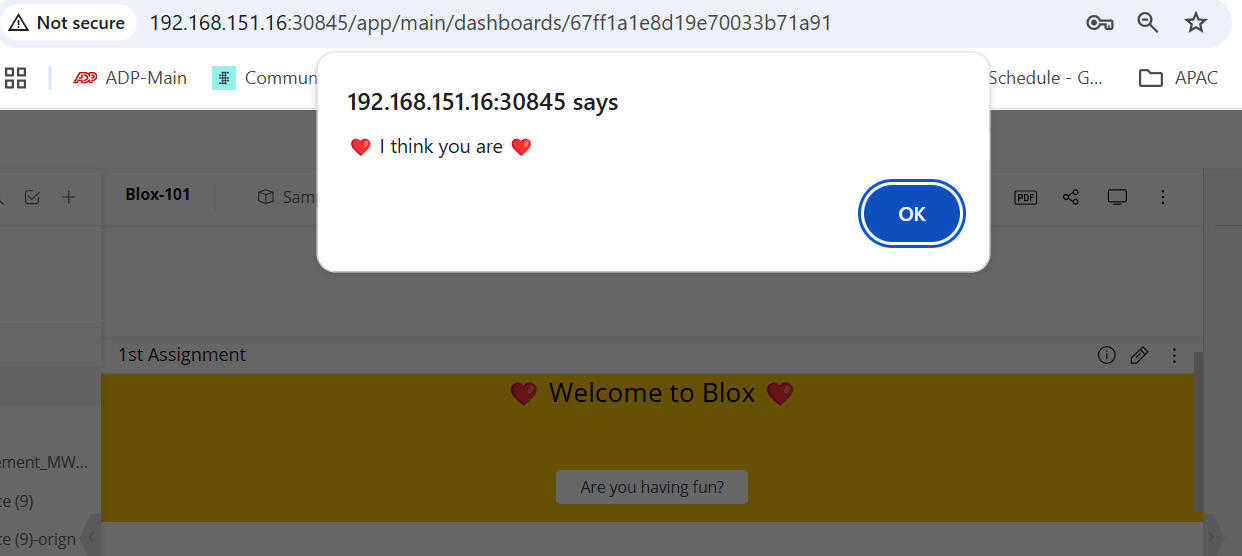
-
Click Are you having fun? to test your widget.

The following message appears:
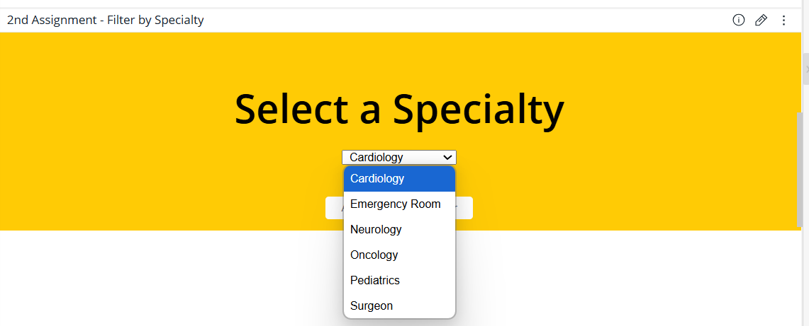
Dynamic Drop-down Filter
Use the Dynamic Drop-down Filter to filter results using a drop-down menu.
The filter creates a drop-down list using values from a specified field, allowing users to refine the dashboard data. It can be used to filter by categories such as brand or region.
Add the following code to the Editor section of BloX:
{
  "showCarousel": true,
  "carouselAnimation": {
    "delay": 0,
    "showButtons": false
  },
  "body": [
    {
      "type": "Container",
      "style": {
        "justify-items": "center",
        "align-items": "center"
      },
      "items": [
        {
          "type": "TextBlock",
          "spacing": "medium",
          "size": "large",
          "text": "Select a Specialty",
          "style": {
            "text-align": "center",
            "font-weight": "600"
          }
        },
        {
          "type": "Container",
          "spacing": "small",
          "items": [
            {
              "type": "Input.ChoiceSet",
              "id": "data.filters[0].filterJaql.members[0]",
              "displayType": "compact",
              "style": {
                "align-self": "center"
              },
              "choices": "{choices:Specialty}"
            }
          ]
        }
      ]
    }
  ],
  "actions": [
    {
    "type": "Filters",
      "title": "Apply",
      "data": {
        "filters": [
          {
            "panelName": "Specialty",
            "filterJaql": {
              "explicit": true,
              "members": [""]
            }
          }
        ]
      }
    },
    {
      "type": "Filters",
      "title": "Clear",
      "data": {
        "filters": [
          {
            "panelName": "Specialty",
            "filterJaql": {
              "explicit": true,
              "all": true
            }
          }
        ]
      }
    }
  ]
}
To select the dataset to be used for the dropdown menu:
In the lefthand panel, click the plus icon and add the field or fields to be used to populate the dropdown menu.
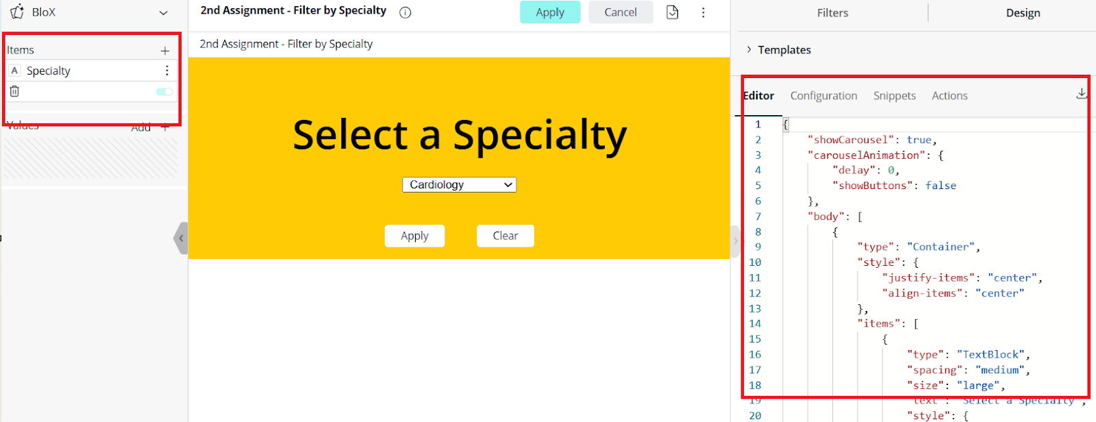
At the top of the editor, click Apply. The new widget appears on the dashboard.
Note:
The dashboard filters do not affect the widget.